Scope:
This project was part of a redesign for our e-commerce website. The main goal was to improve the user experience, optimize the path to purchase throughout the site, and approach a few design challenges (outlined below).
Contribution:
Collaborating with the marketing team and following best practices for modern e-commerce design, our team reviewed the best use cases and reports from leading electronics e-commerce retailers. Based on these findings, I designed the wireframes, mockups, and prototypes, then collaborated with the development team to produce the final published pages.
Design rationale:
By looking at successful user experience solutions from leading electronics e-commerce retailers, including user-based reports on best practices for e-commerce, key stakeholders, and marketing, I was able to distill the right solution for this redesign.
Achievements:
Post-launch, we tested iteratively and achieved an increase in conversion rate by 28%
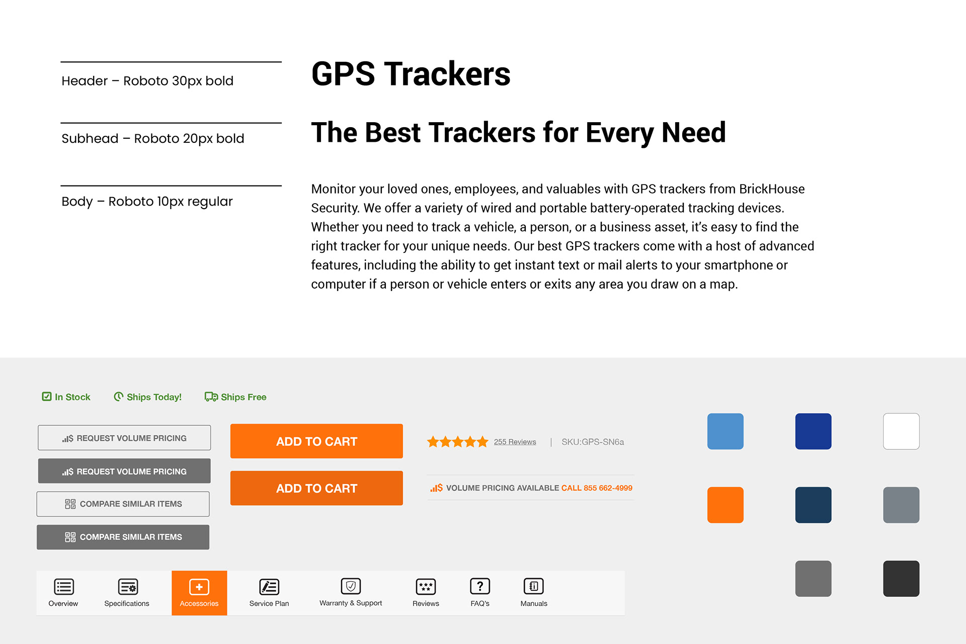
Brand elements
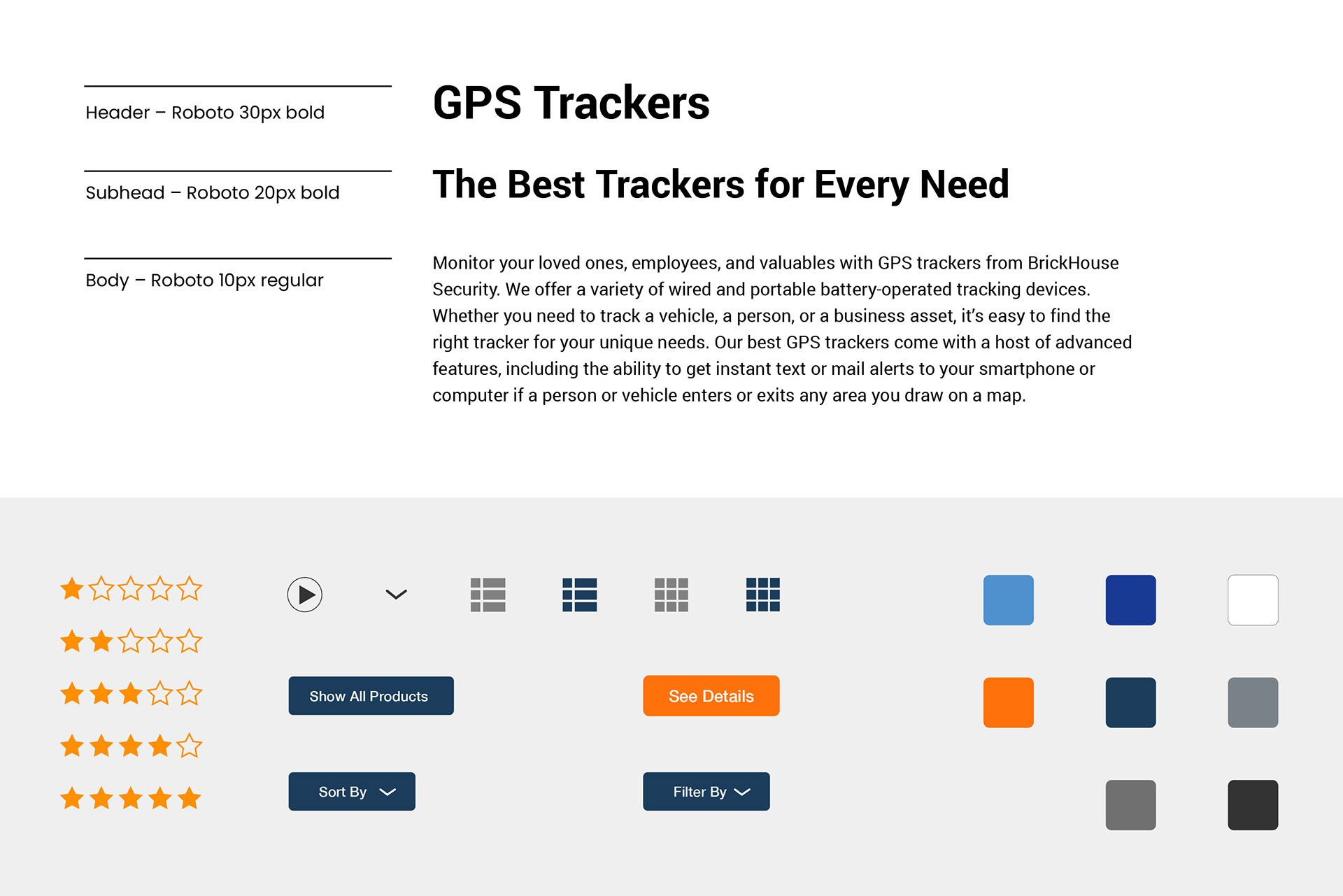
These are the primary elements and library assets for the BrickHouse Security product directory page design. They consist of typography followed by UI elements, including review star ratings, various call-to-action buttons, and toggle switches for grid and list views. In addition, there are primary, secondary, and tertiary brand colors.
Version 1A and 1B - list and grid view Wireframes
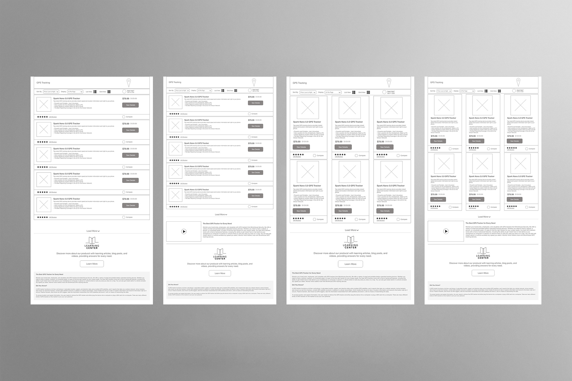
One of the problems we wanted to solve was improving site speed while showing all of our offerings on one page. Based on some research, we determined that a dynamic load with a "load more" button at the bottom of the page would be an ideal solution.
Another issue we considered was how many products could fit above the fold. The example above features an option for a list or grid view (with variations in how the SEO text is handled), further optimizing the user experience by allowing the user to view the product layout in their preferred layout.
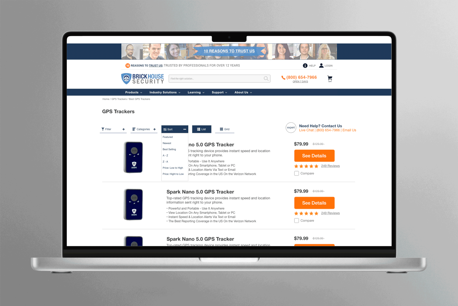
Version 2A - list and grid view
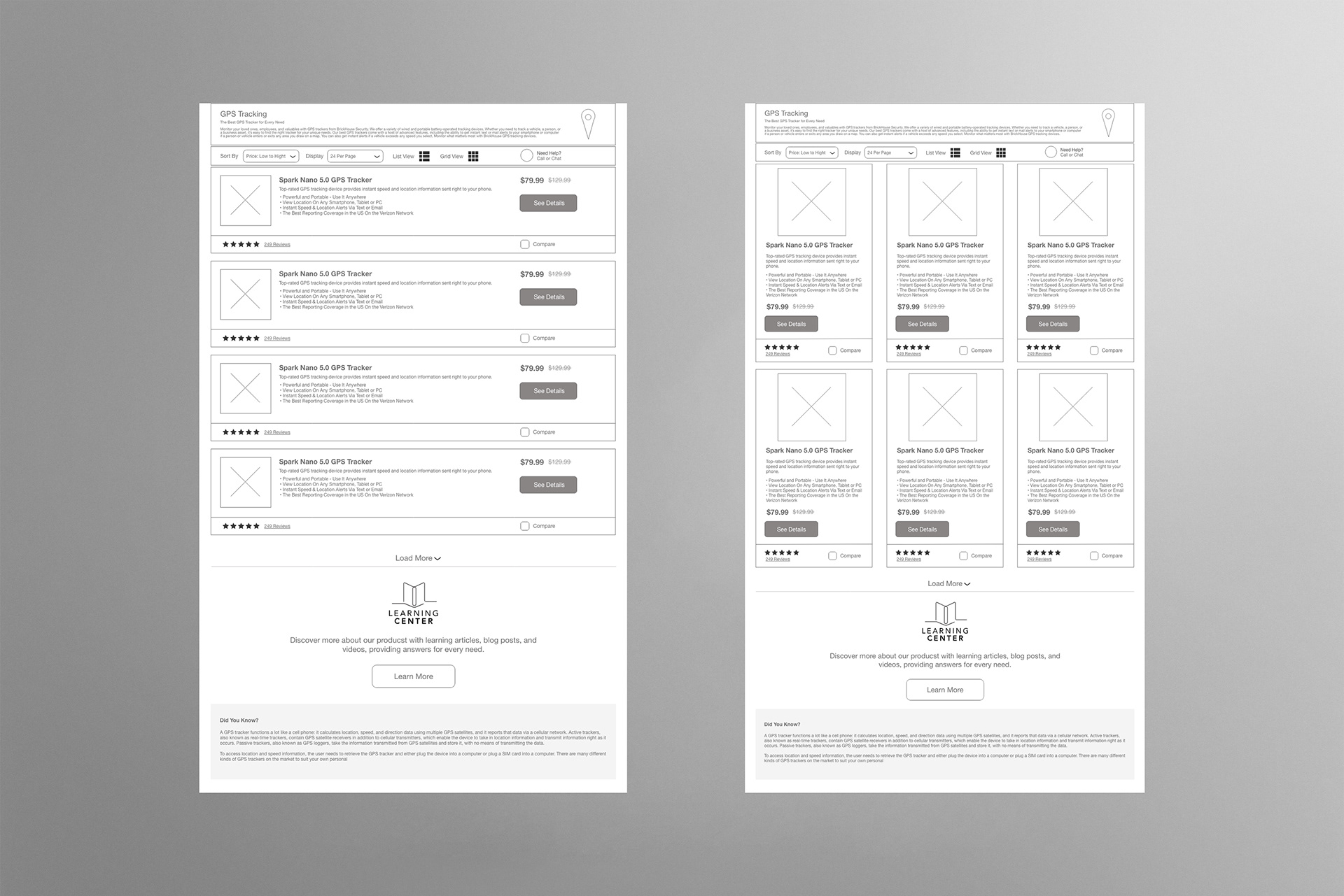
One obstacle we had to consider during the redesign was ensuring the SEO copy was as compelling and helpful to shoppers as possible. This version features some SEO copy at the top as an "explainer," while the rest is below the page fold.
Version 2B - list and grid view
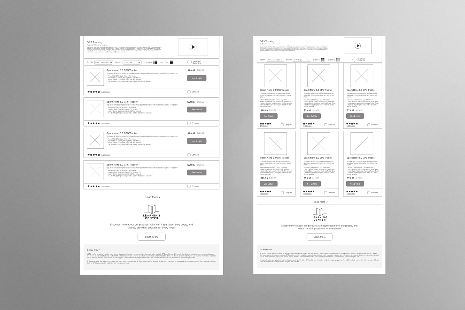
This was the final version approved for the next phase of design, which is to create high-fidelity mockups. This wireframe included all the components desired by the key stakeholders. According to our research, SEO copy ranked at the top as the best solution for driving organic traffic to our site while providing shoppers with meaningful information about the product line.
In addition, to drive further engagement, we featured a product summary video to help users identify their product needs.
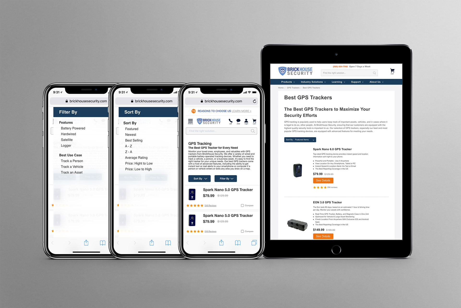
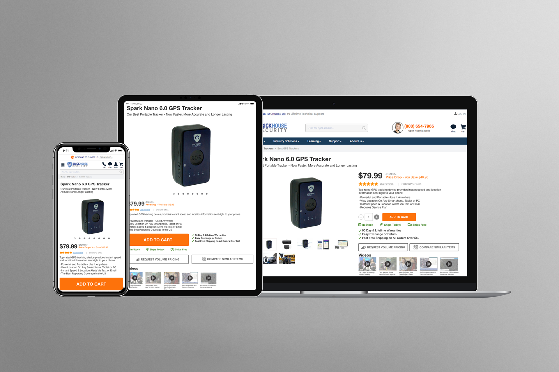
Mobile version wireframes

During the redesign phase, we determined that the mobile experience should use a list view, as it allows more products to be displayed above the fold. Designing for mobile-first is essential, and these wireframes capture the various list view types we considered, based on how tight the spacing should be to allow more products to appear above.
Preliminary mockup
These are some of the first mockups I created using Adobe XD and shared with the team for approval. These versions were iterative, changing quickly and often as I was designing.
Final mockup

This was the final mockup before going into development. It features all requested changes from the design phase, including an SEO paragraph at the top and an introductory video per the final wireframe. As a result, this directory page served as a template for the rest of the site's directory pages.
Following the launch of the directory page redesign, we diligently monitored user interactions using Google Analytics and HotJar. This user-centric approach led us to discover that most of our customers were not using the grid or list view features, nor were they filtering using the included facet filters. In response, we removed these features, ensuring that the primary design on the BrickHouse Security site remains user-friendly. You can view the live site with the link below.
To view the live site, please click here.
The Prototypes
Mobile View - Filter and Sort By Menu Animation
Mobile user flow of the search Filter and Sort By menu animation. The prototype was created to depict the direction in which the menu is intended to animate and the speed at which the animation should occur.
Product Directory Page Prototype - Category Menu Animation
This user flow features category facet menu animation. This prototype was created to show the intended animation effect as a guideline for developers and stakeholders to see the site's functionality.
Product Directory Page Prototype - Filter By Menu Animation
This user flow depicts the "Filter By" menu animation. This prototype was created to aid the feature's development by showing how the menu is supposed to animate.
To view the live site, please click here.
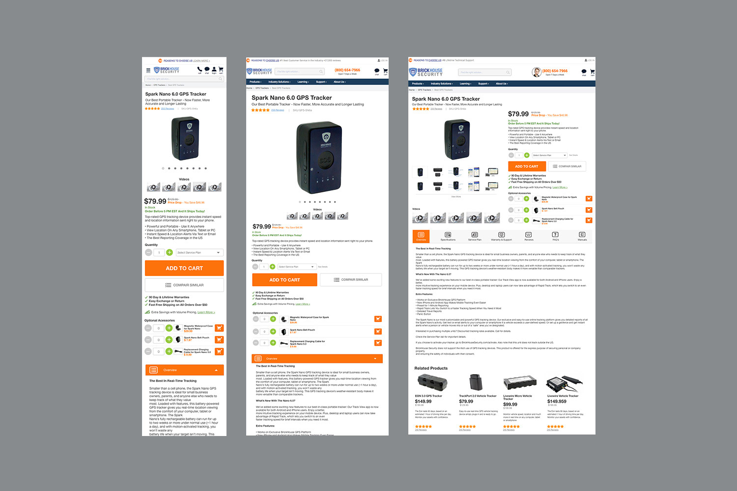
Web UX/UI Design Product Detail Pages
Working with internal stakeholders, I researched the best user experience conventions. I implemented them uniquely, incorporating the company's business needs, the brand, and a suggested minimalist design direction. I used a "mobile-first" methodology and applied "atomic design" principles when creating the mockup and prototype.
Brand and UI Assets
Prototypes
The prototypes below were made in Adobe XD as part of our product detail page redesign. The redesign needed to address specific business requirements, outlined below.
Product kit selection - add to cart
This is a prototype showing the intended user experience of attempting to add a camera kit to the cart. It displays a prompt that prompts the user to select a specific camera kit option.
Capacity selection
Prototype showing the user experience when selecting a particular product capacity.
Color selection
This prototype depicts color selection and the UI elements that indicate the selected color.
Request stock alert
This user flow depicts a stock alert for an out-of-stock item. It features a would-be user navigating to the request stock alert button, inputting their email in the model menu form, and submitting the stock alert. It features a confirmation and sends an email confirmation as part of the user experience.
Service plan selection
This user flow depicts a service plan selection from the dropdown menu. The validation feature in the prototype was requested by our customer service team, as many orders for this product were submitted without a mandatory service plan, which required the GPS tracker to be used entirely.
To ensure a friendly, cohesive user experience, we prevented users from adding the item to their cart unless they selected a service plan. This ensured that our customers understood that the product requires a service agreement to check out.
Request volume discount modal
Our sales team requested the ability to request a volume discount online. This allowed the user to quickly request that a salesperson contact them if they were interested in purchasing in bulk.