Scope:
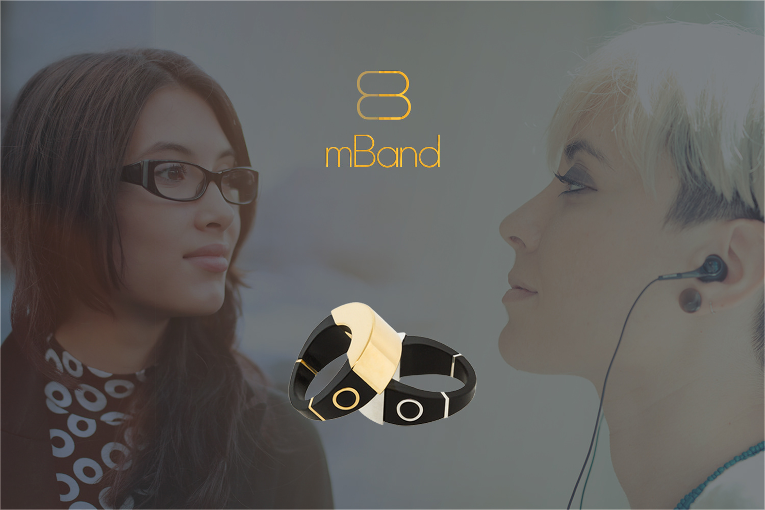
Designed by Rachel Owens, mBand was intended to be a beautiful wearable device that would allow the wearer to send an alert in an emergency. The primary goal was to design a fashionable piece of jewelry that functions as a safety and security device.
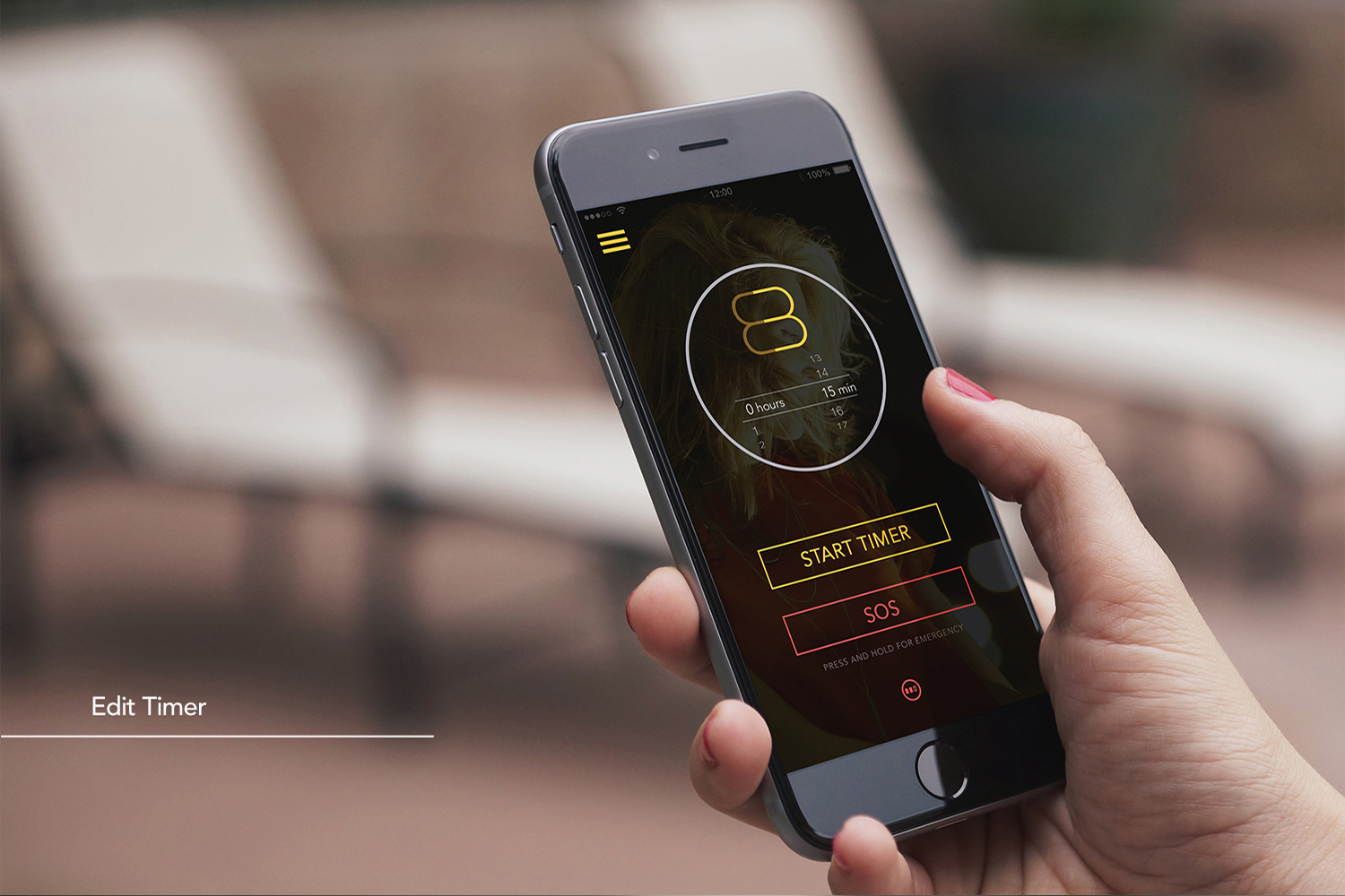
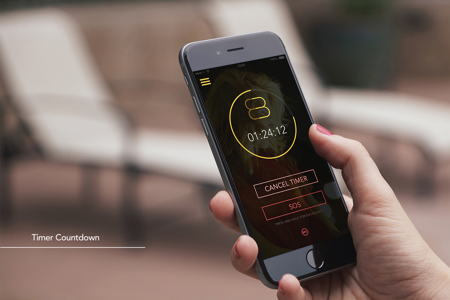
With a press of a button on the side of the ring, mBand sends a text with your GPS location to your close contacts and notifies a central monitoring station of your information.
Contribution:
As the lead designer, I closely collaborated with our in-house creative team, including designers, directors, and other stakeholders. My efforts on the project included: designing the mBand App (UI); designing the mBand brand logo; and closely influencing and developing the mBand brand, including fonts, colors, visual aesthetic/style; creating Kickstarter campaign graphics; and researching the target audience. In addition, I served as the lead photographer and photo editor for the mBand lifestyle product shoot.
Design rational:
As a multidisciplinary designer, I handled a variety of responsibilities. The design process always starts with researching the intended audience, followed by ideation and creating preliminary sketches/concepts for a particular part of the project. This included close collaboration with the creative team, designing UI elements and mockups, creating logo variations, collaborating on storyboards, and developing and delivering the final assets for each project.
Key achievement:
The overall campaign identified various wearable technology demographics and the needs of wearable technology users, and served as valuable market research for future product launches.
See the mBand Kickstarter campaign.
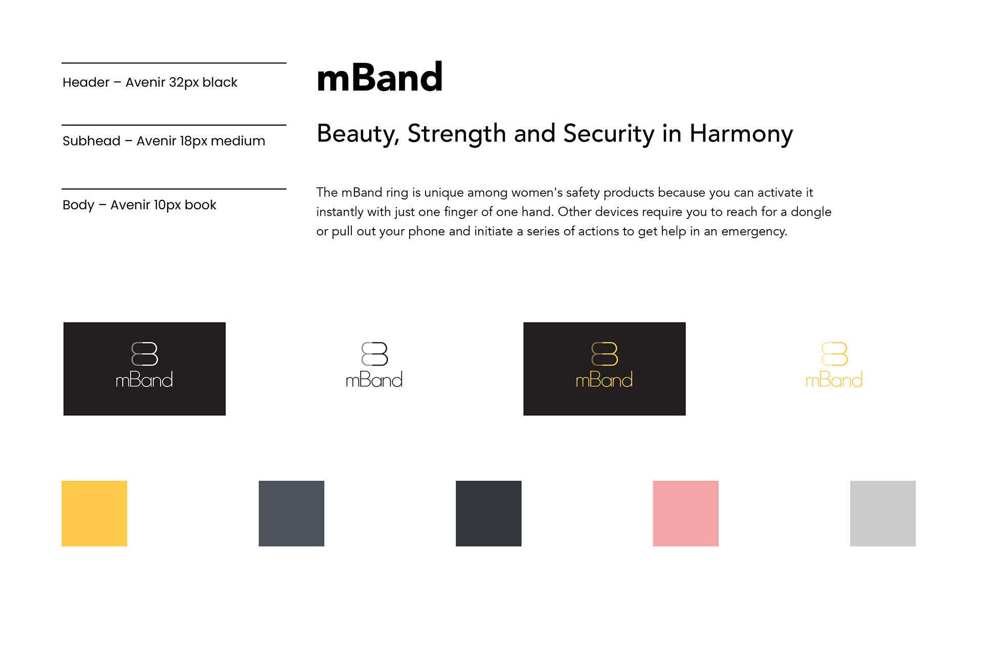
Brand elements
Mood board
In collaboration with the creative director and designers on the in-house design team, I provided art direction and selected key images from Adobe Stock, to be used throughout the brand.


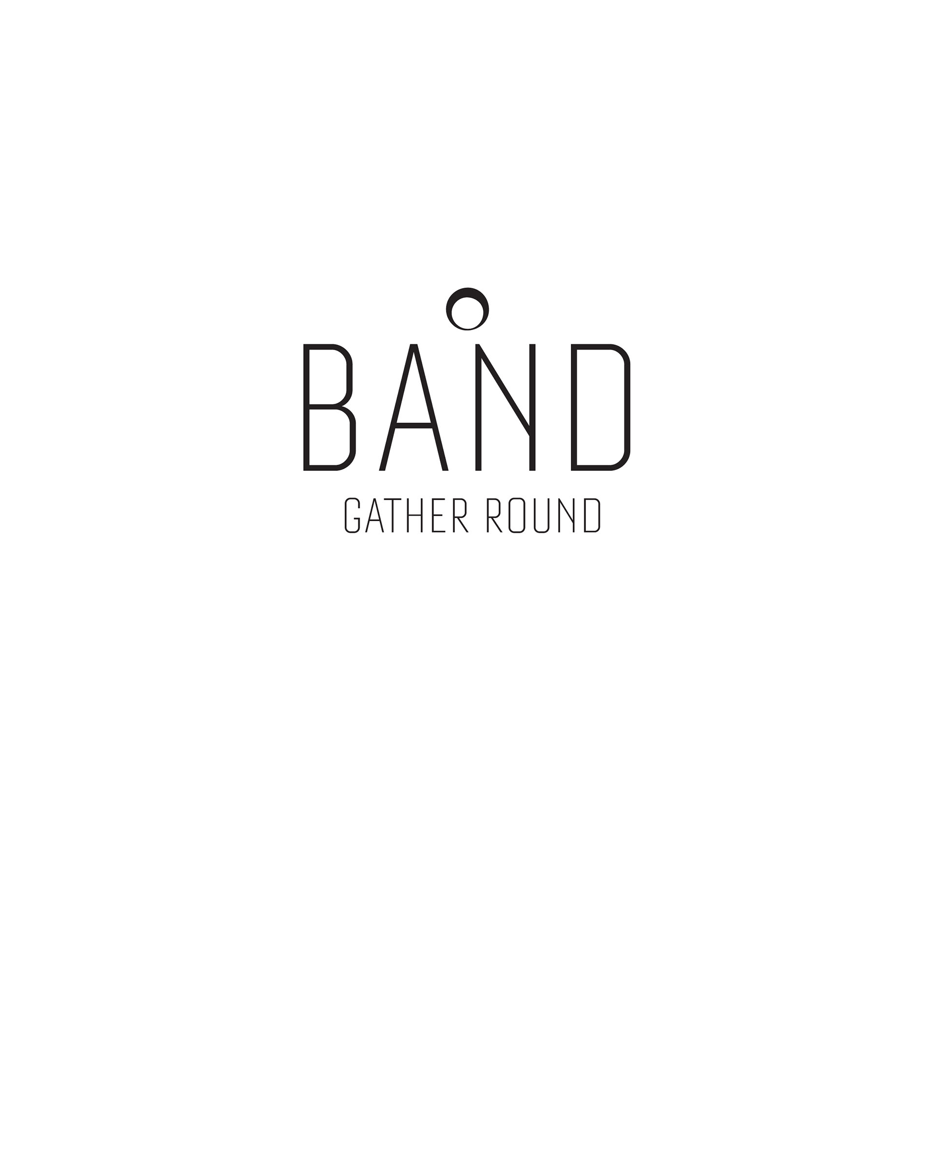
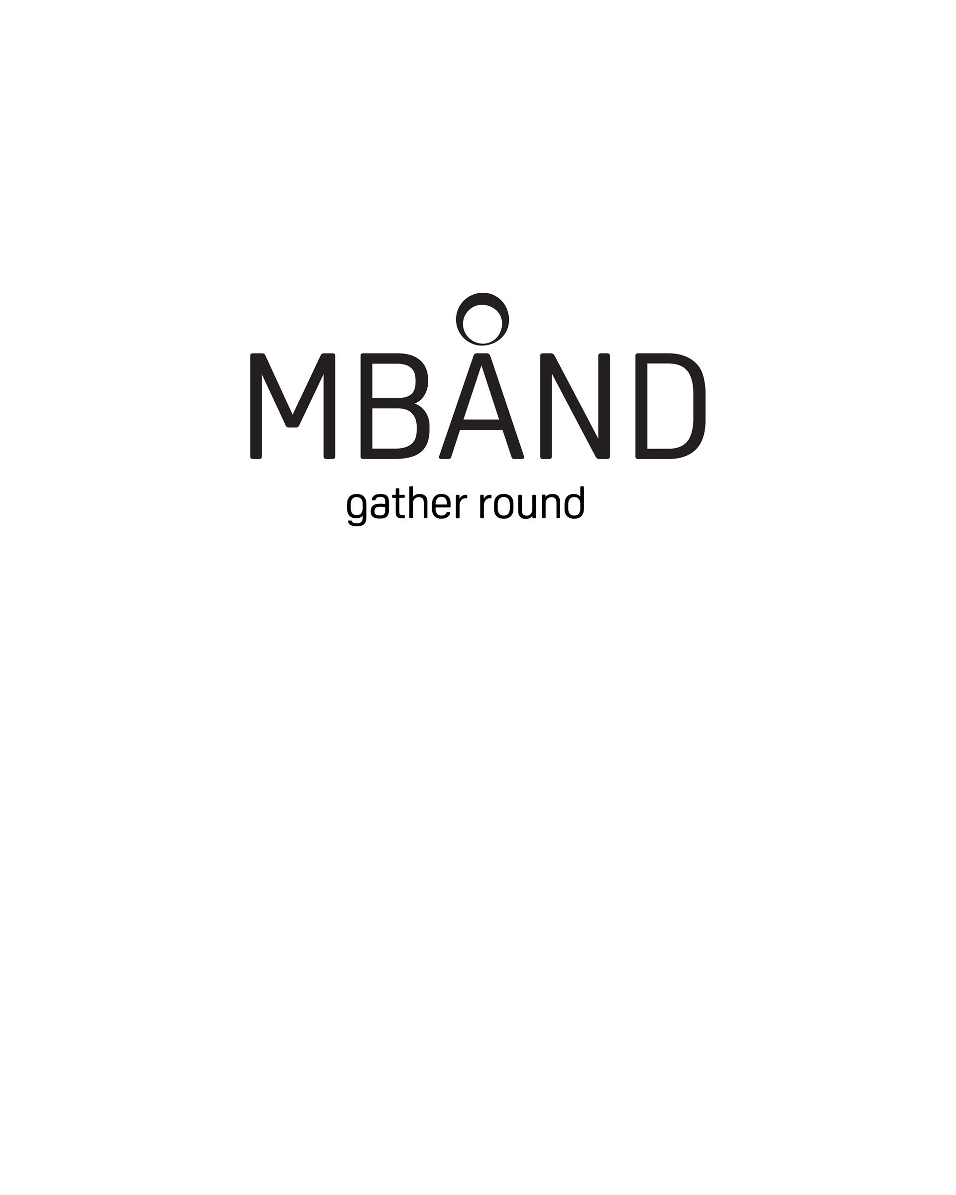
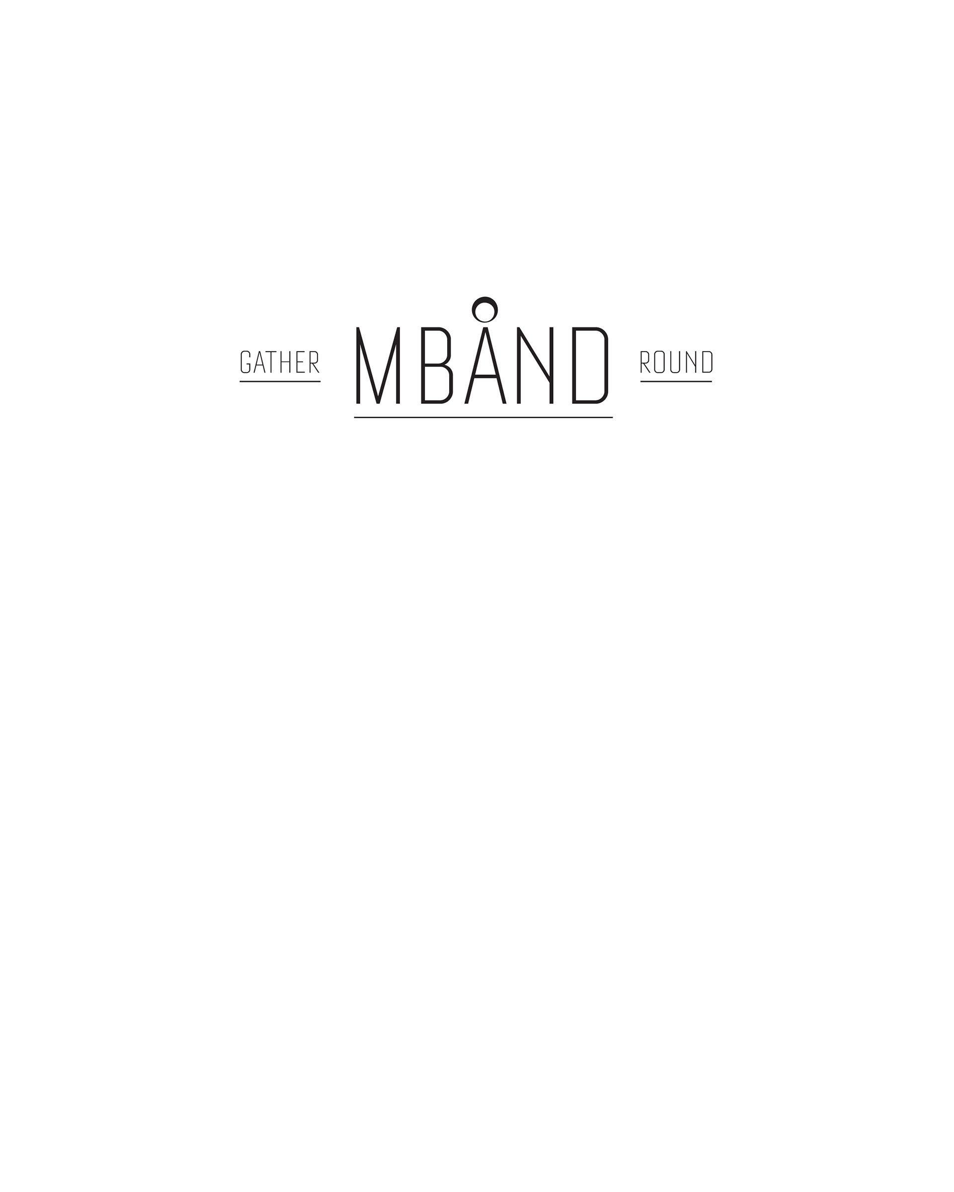
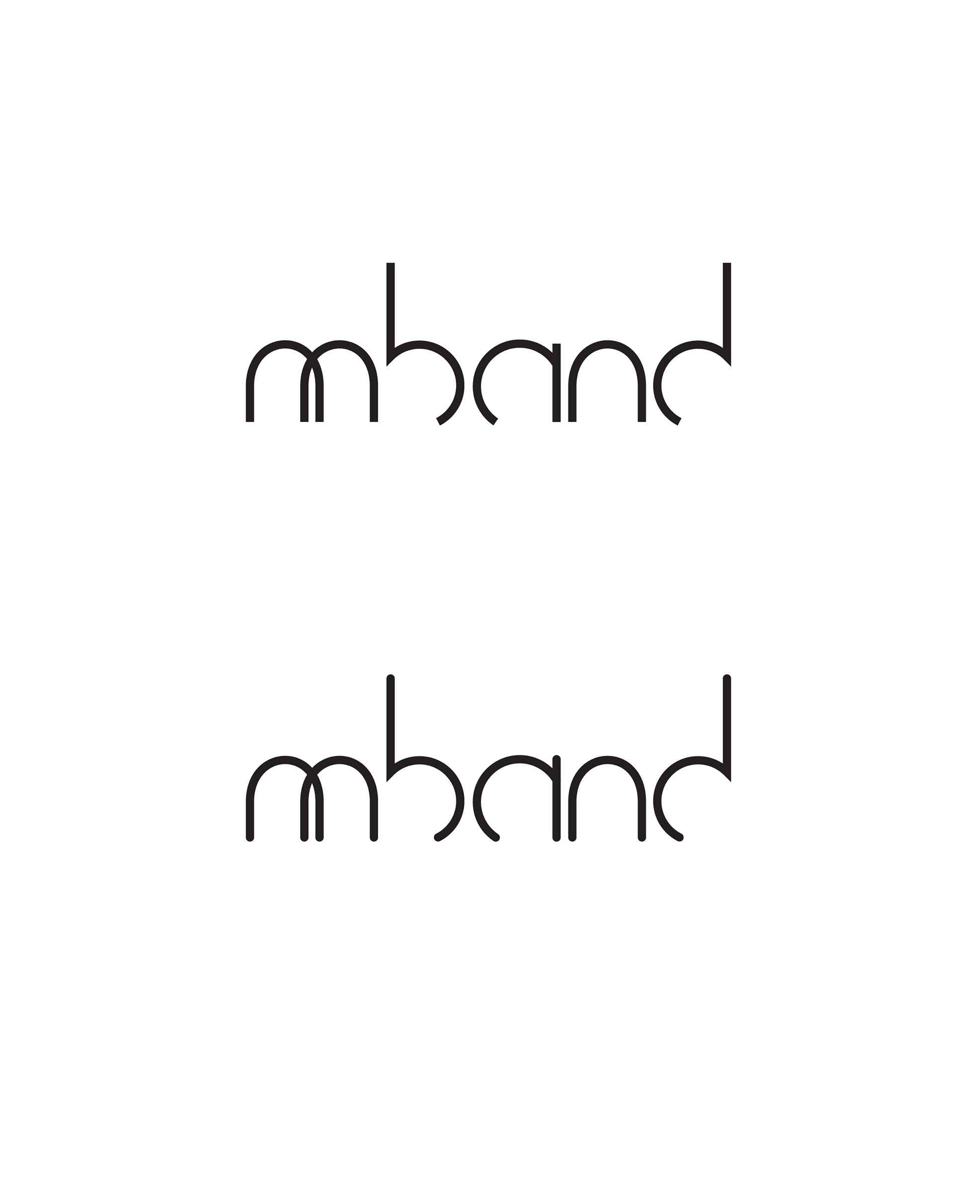
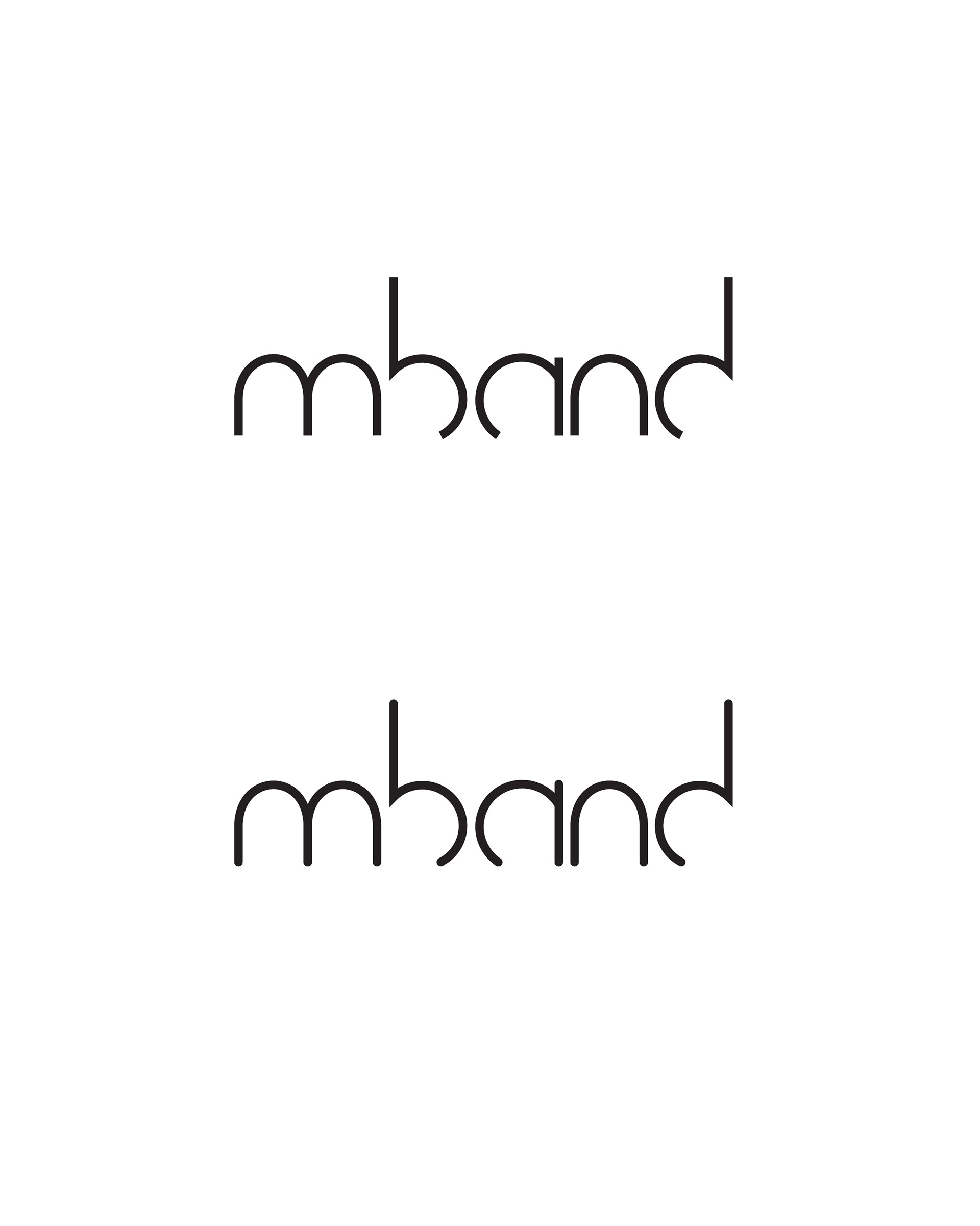
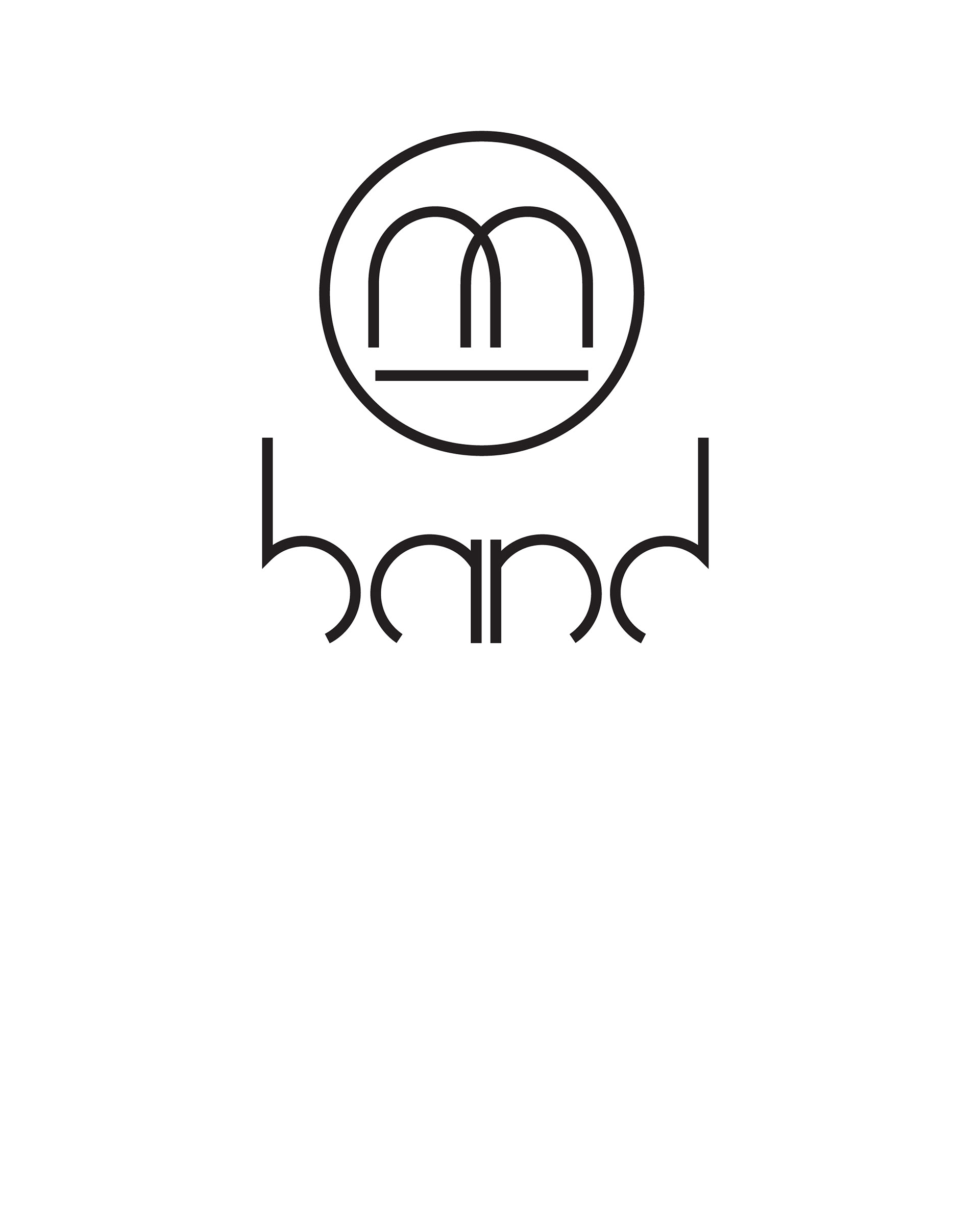
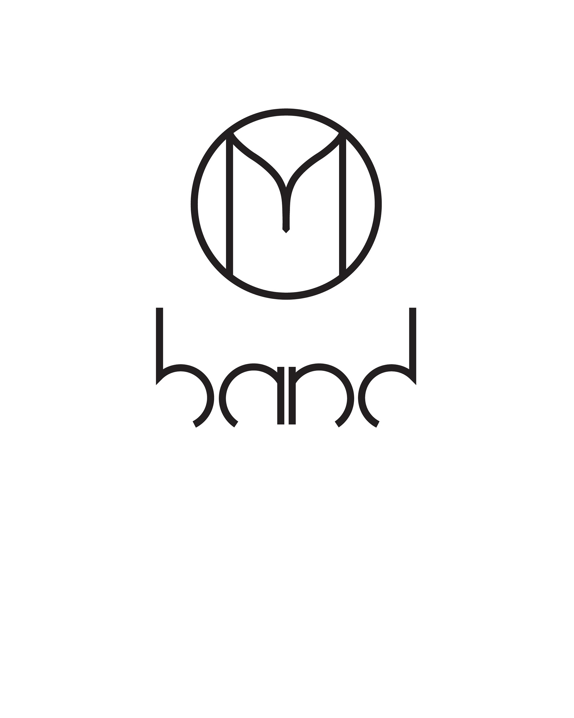
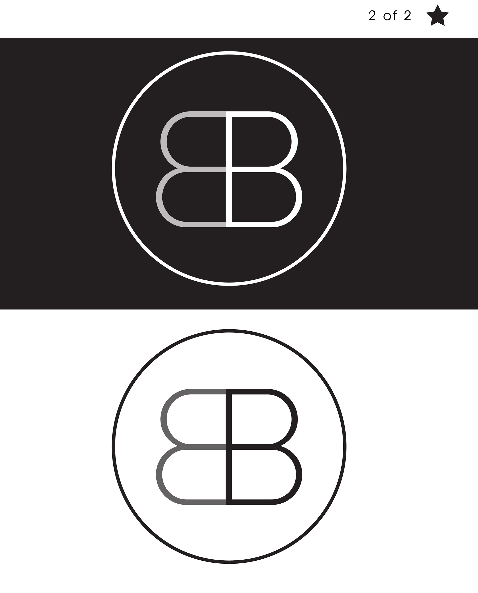
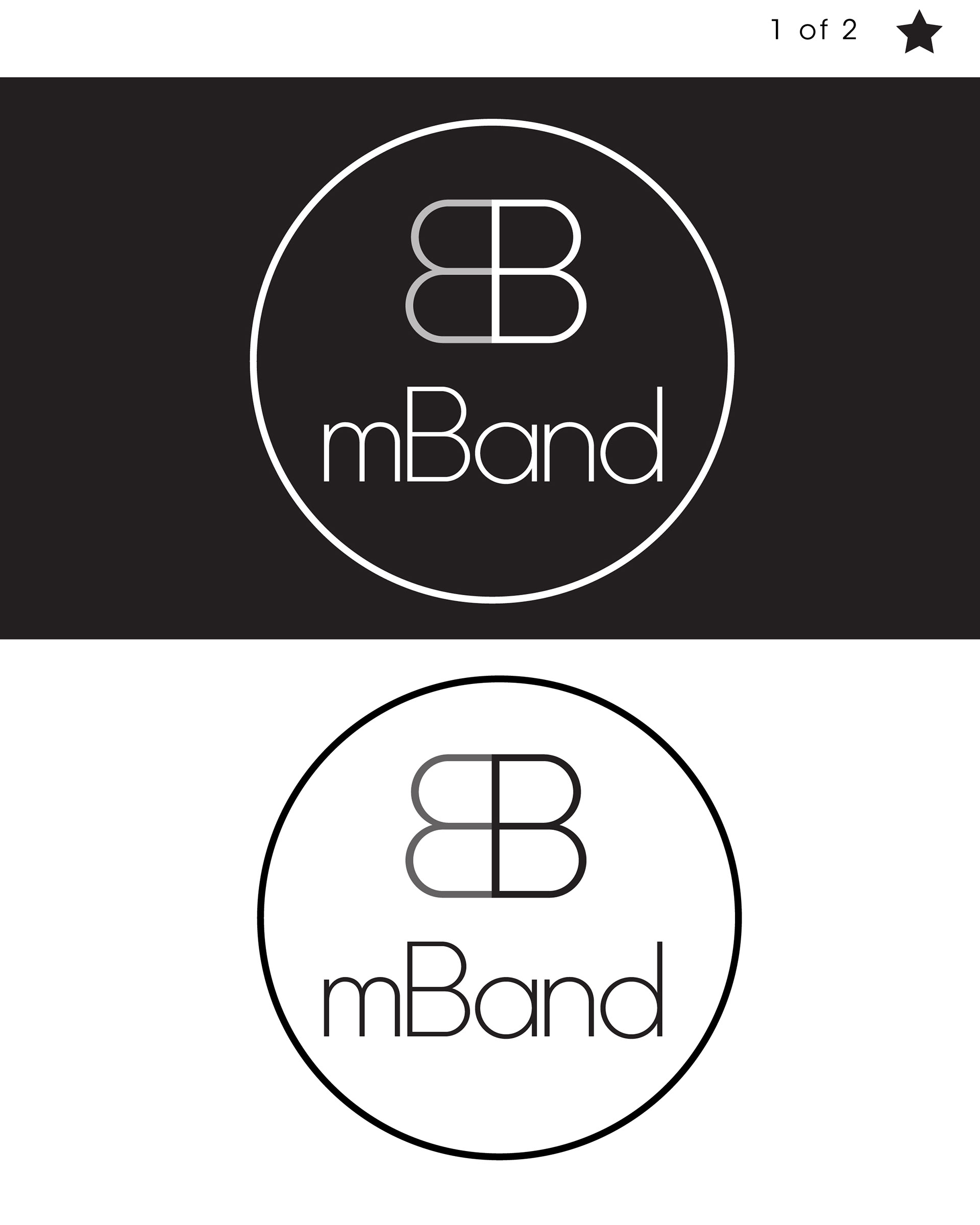
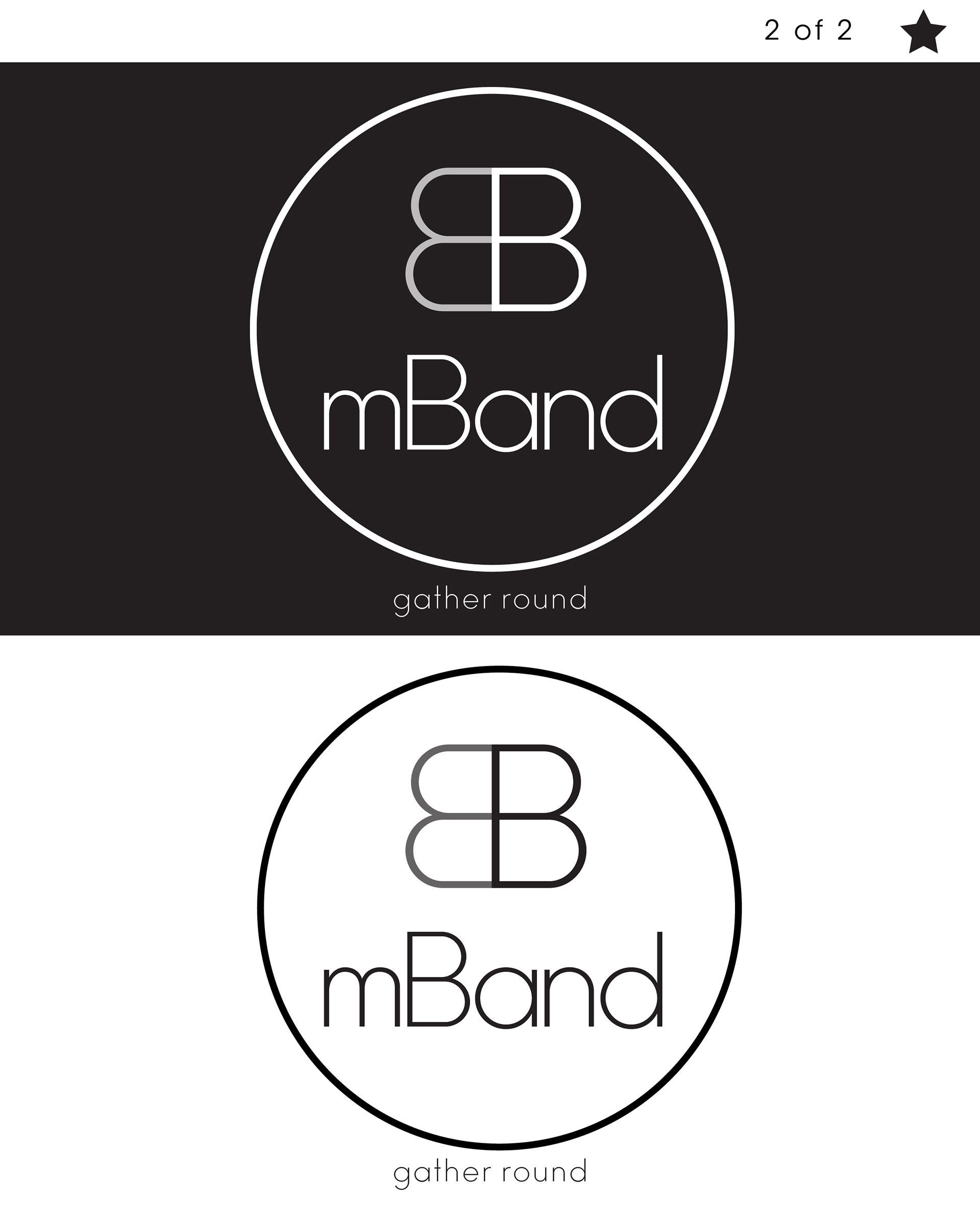
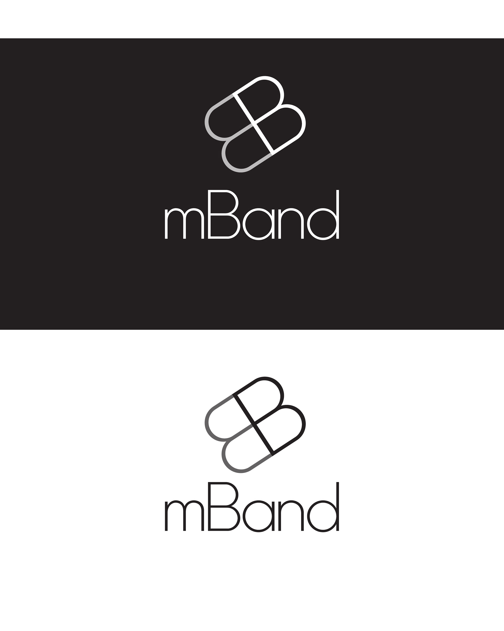
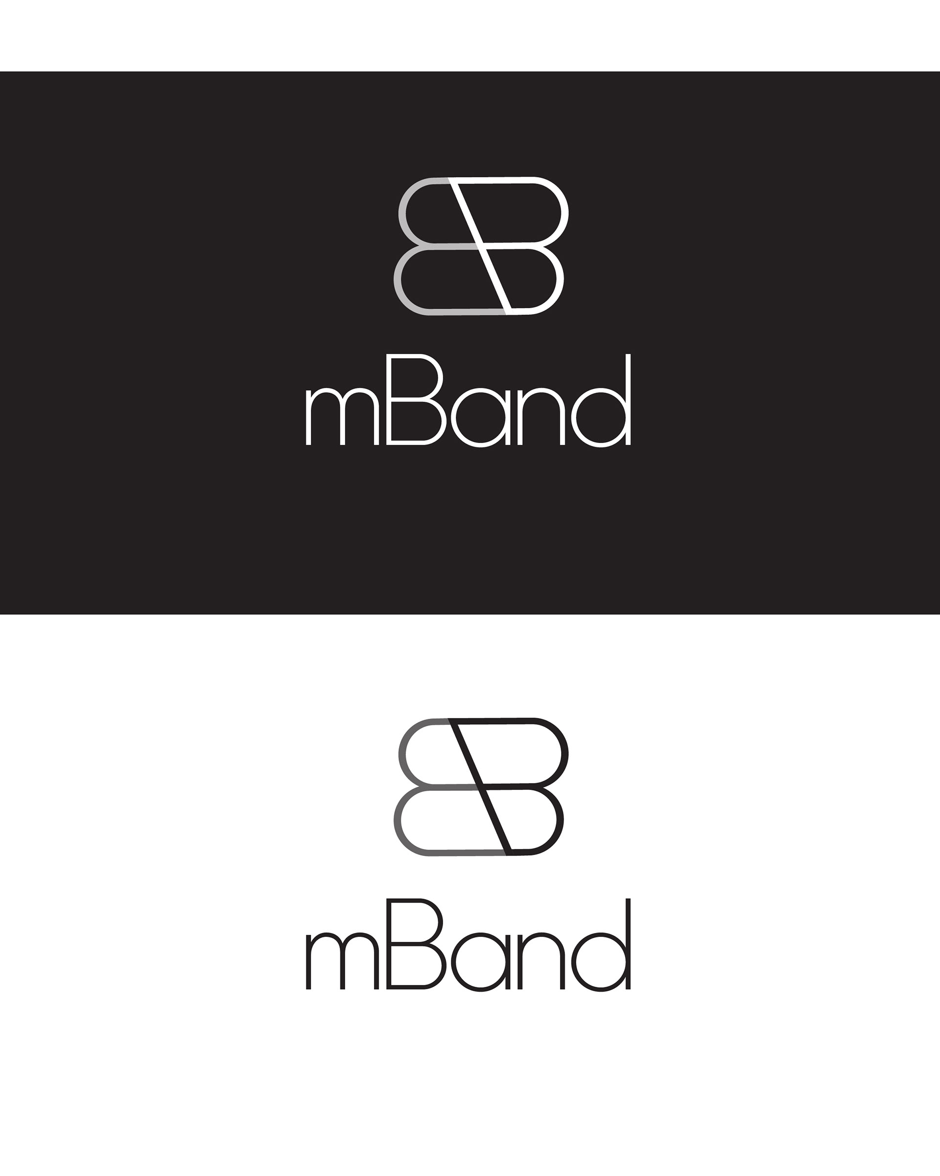
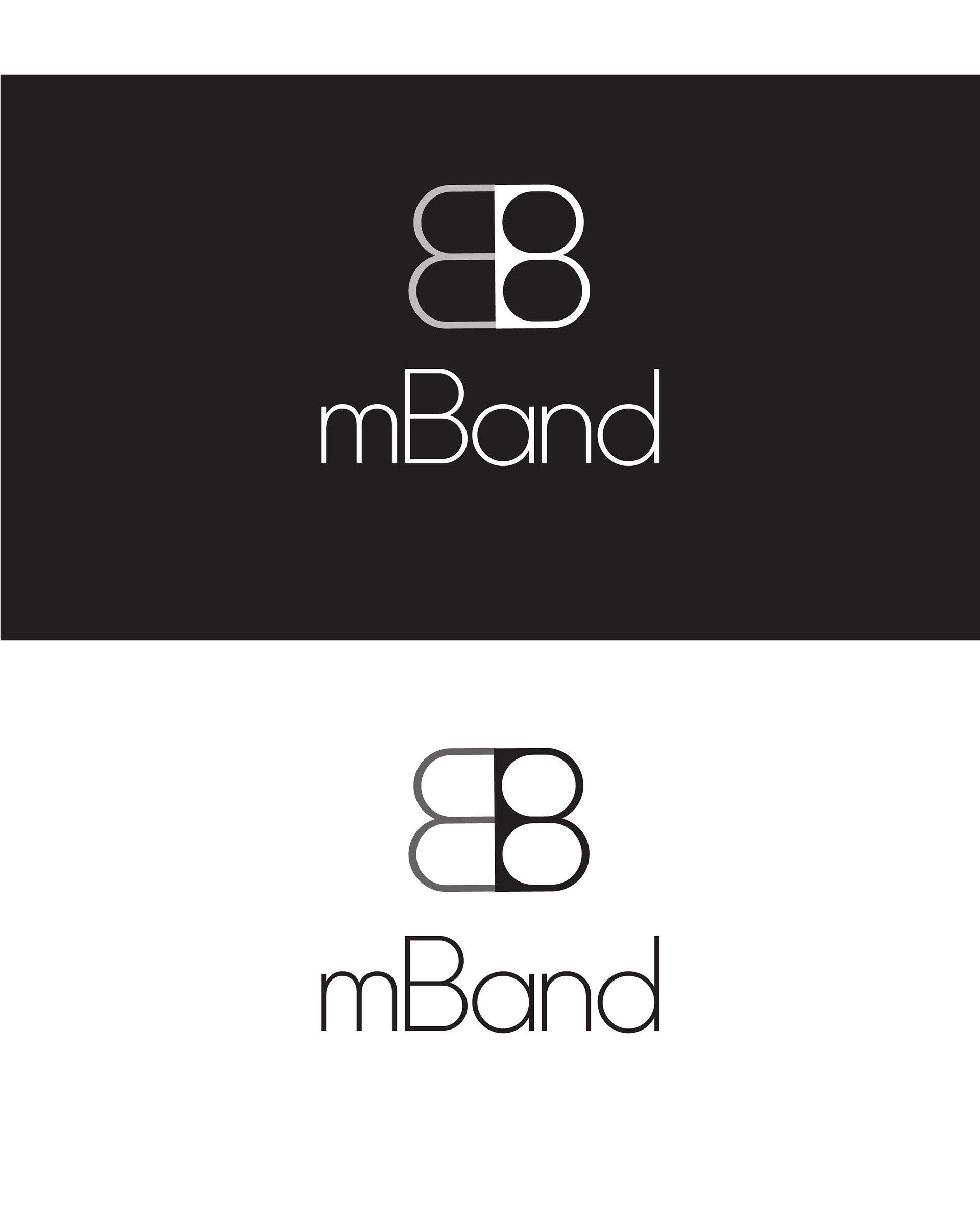
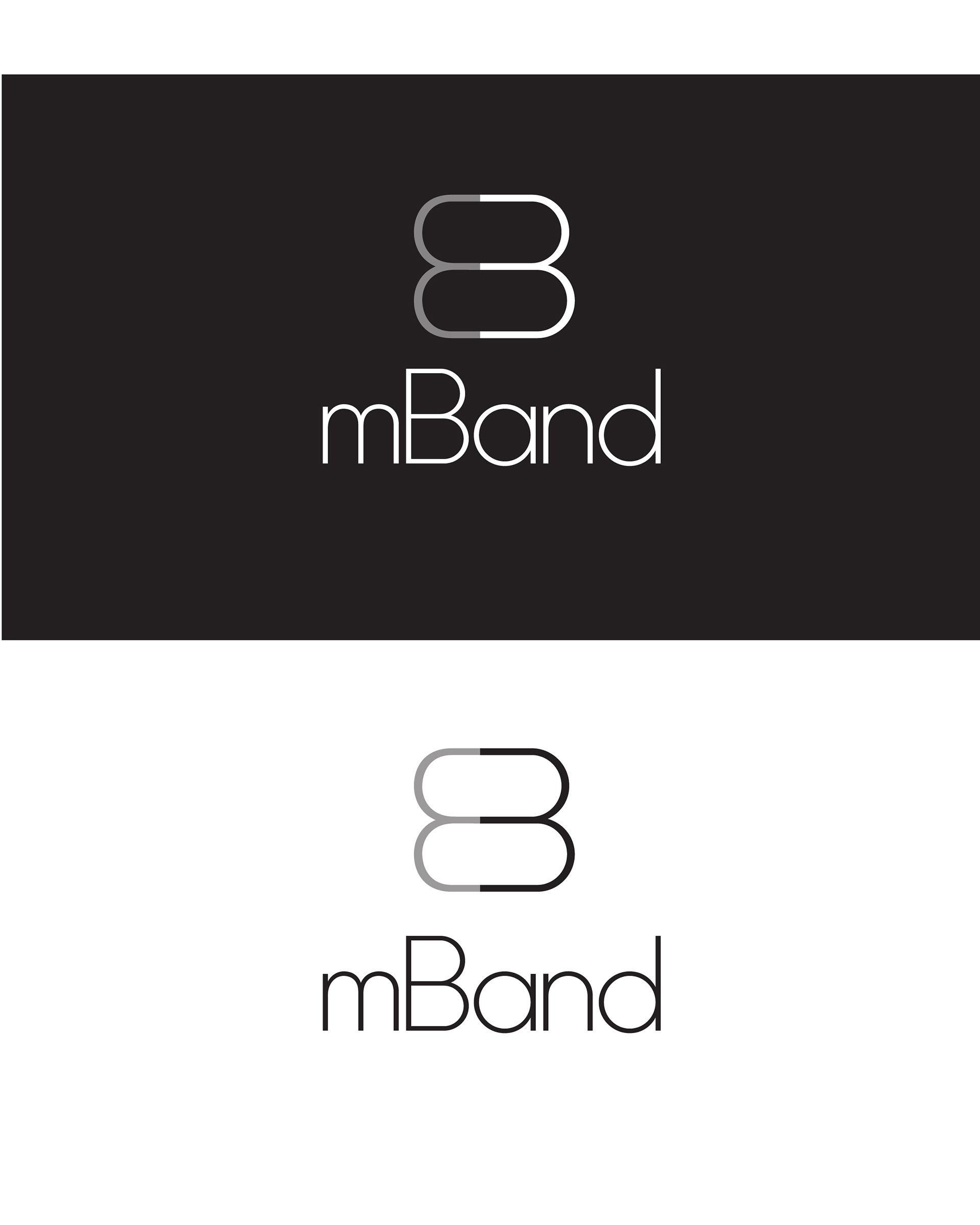
mBand logo
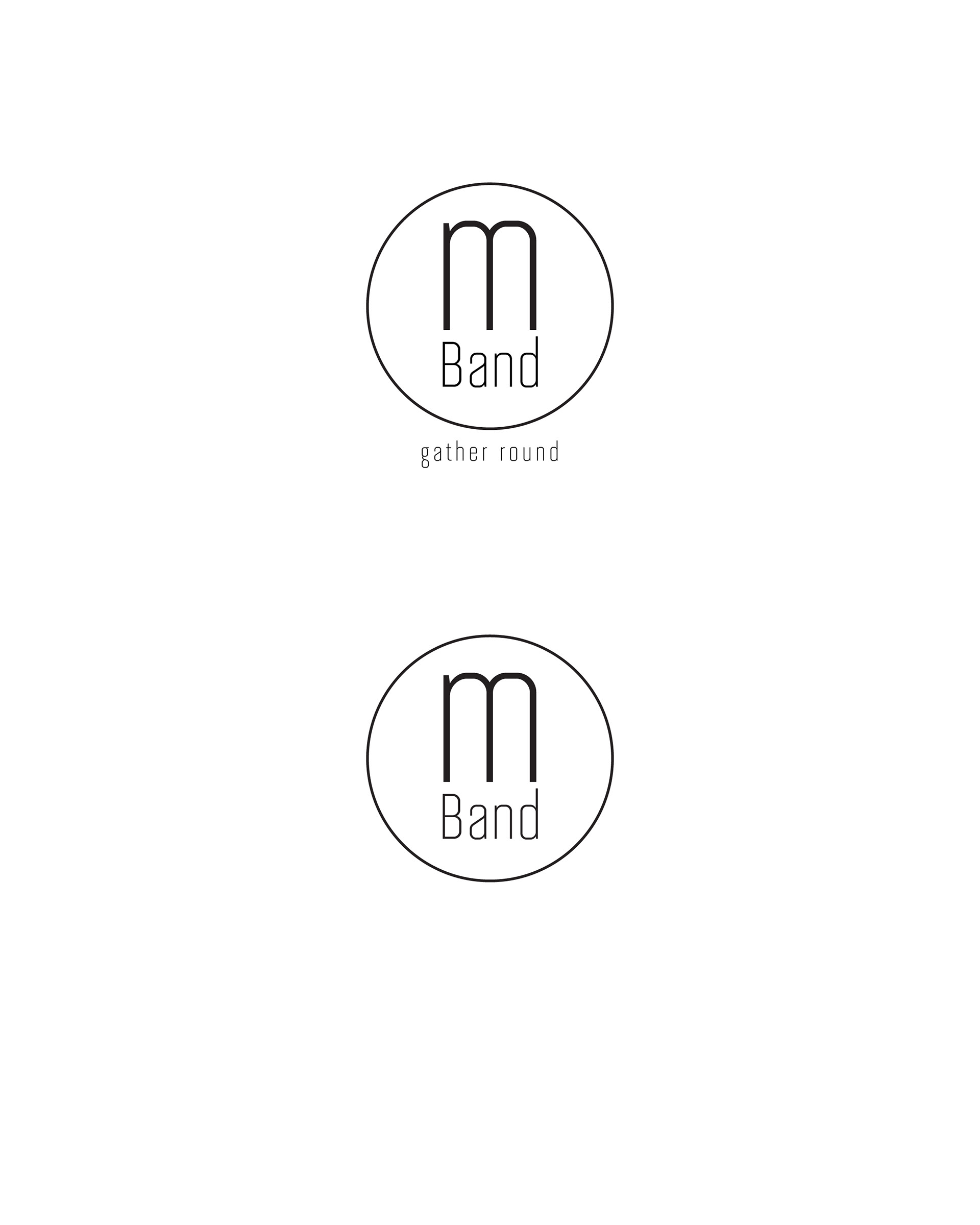
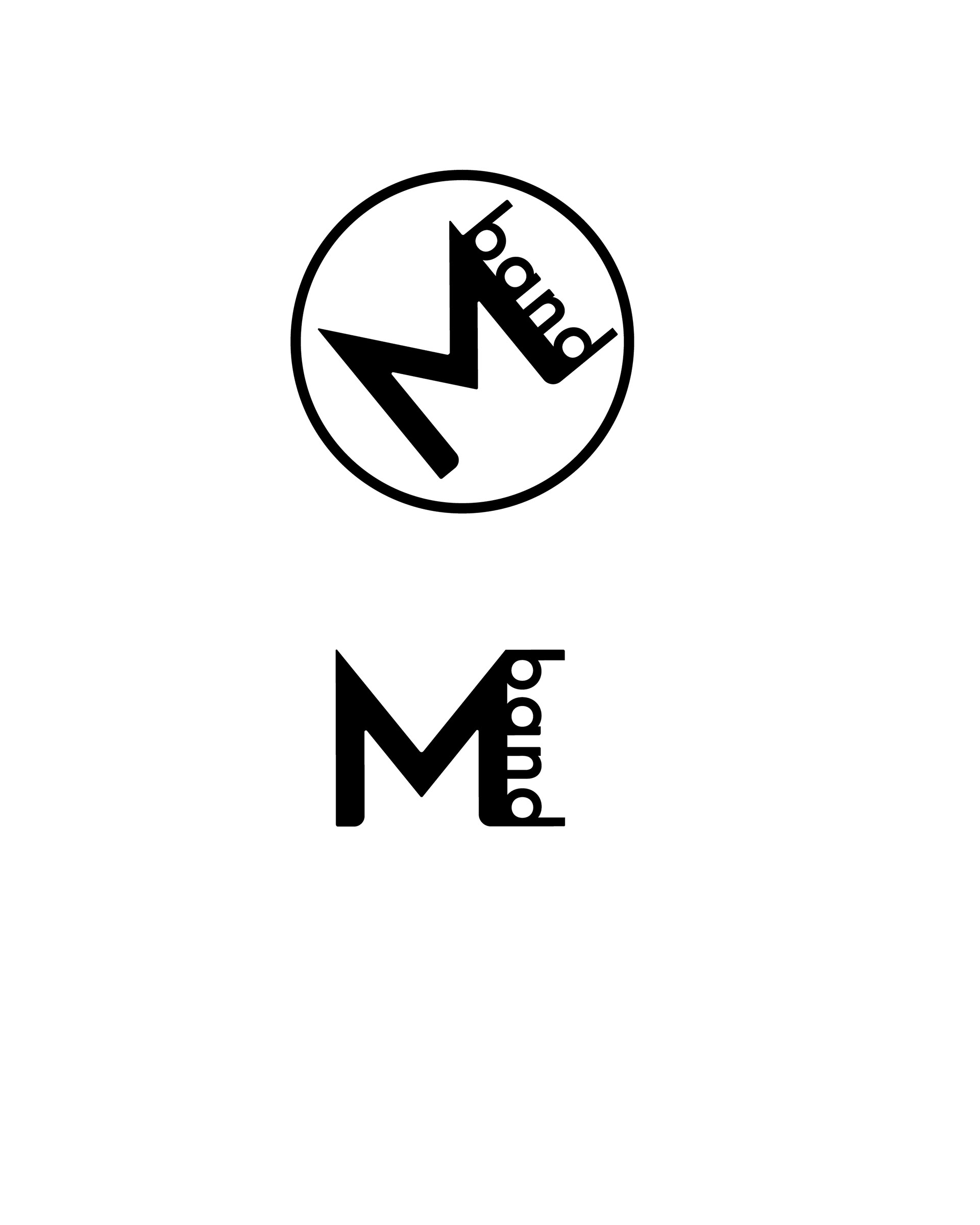
The first gallery, features the first and second round of logos. The second gallery depicts the third round and the bottom gallery depicts the fourth round of changes, followed by the last, final version of the logo.
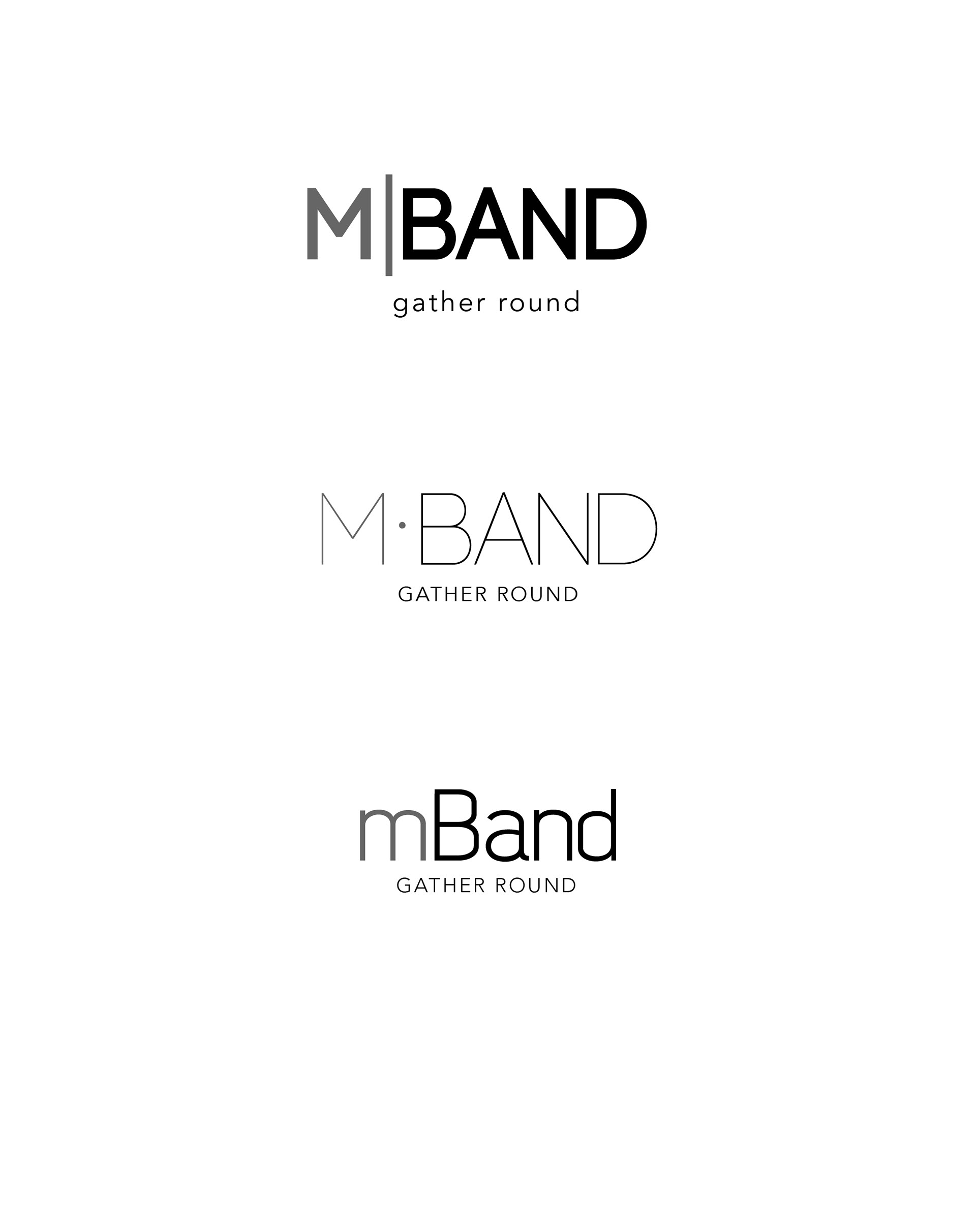
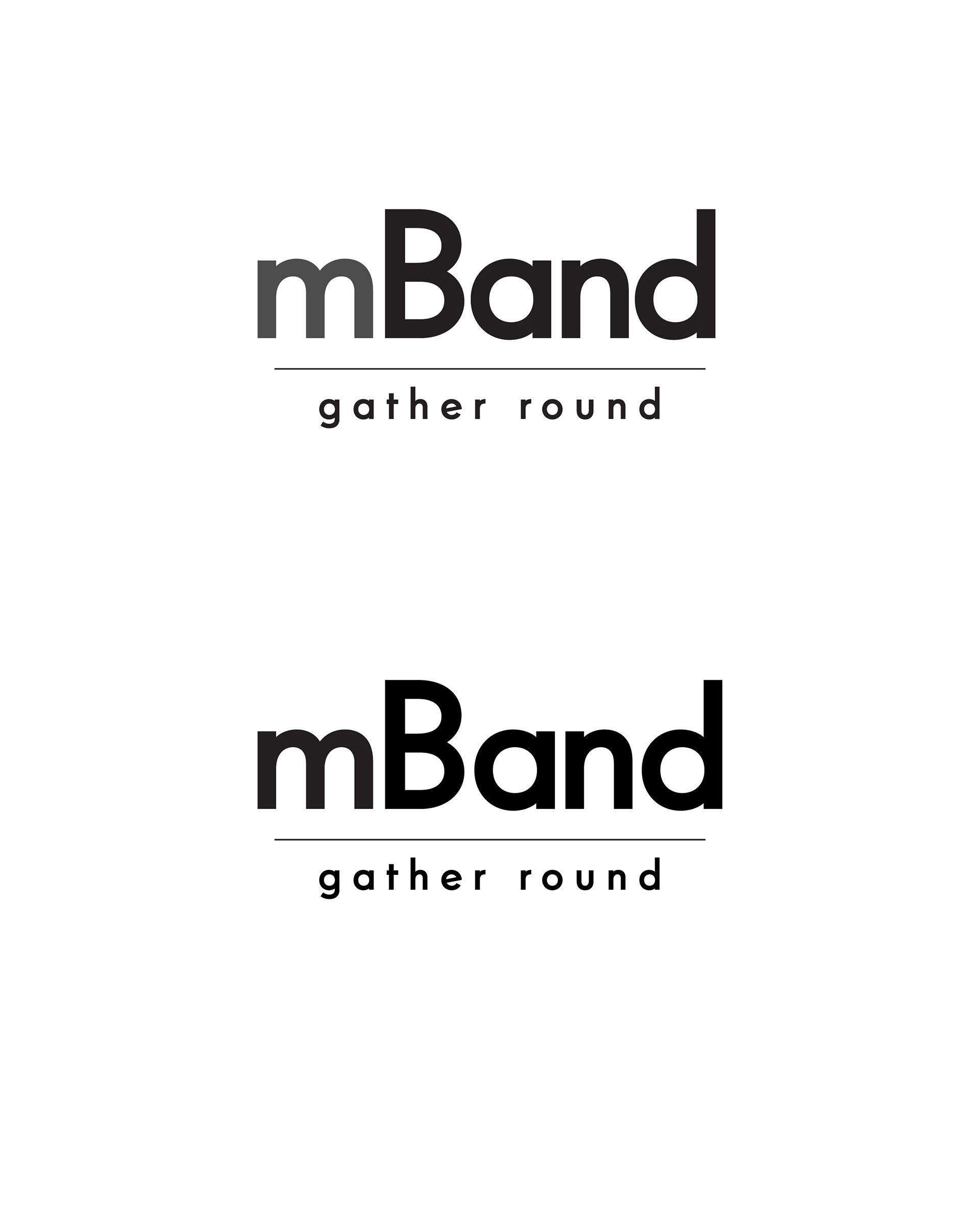
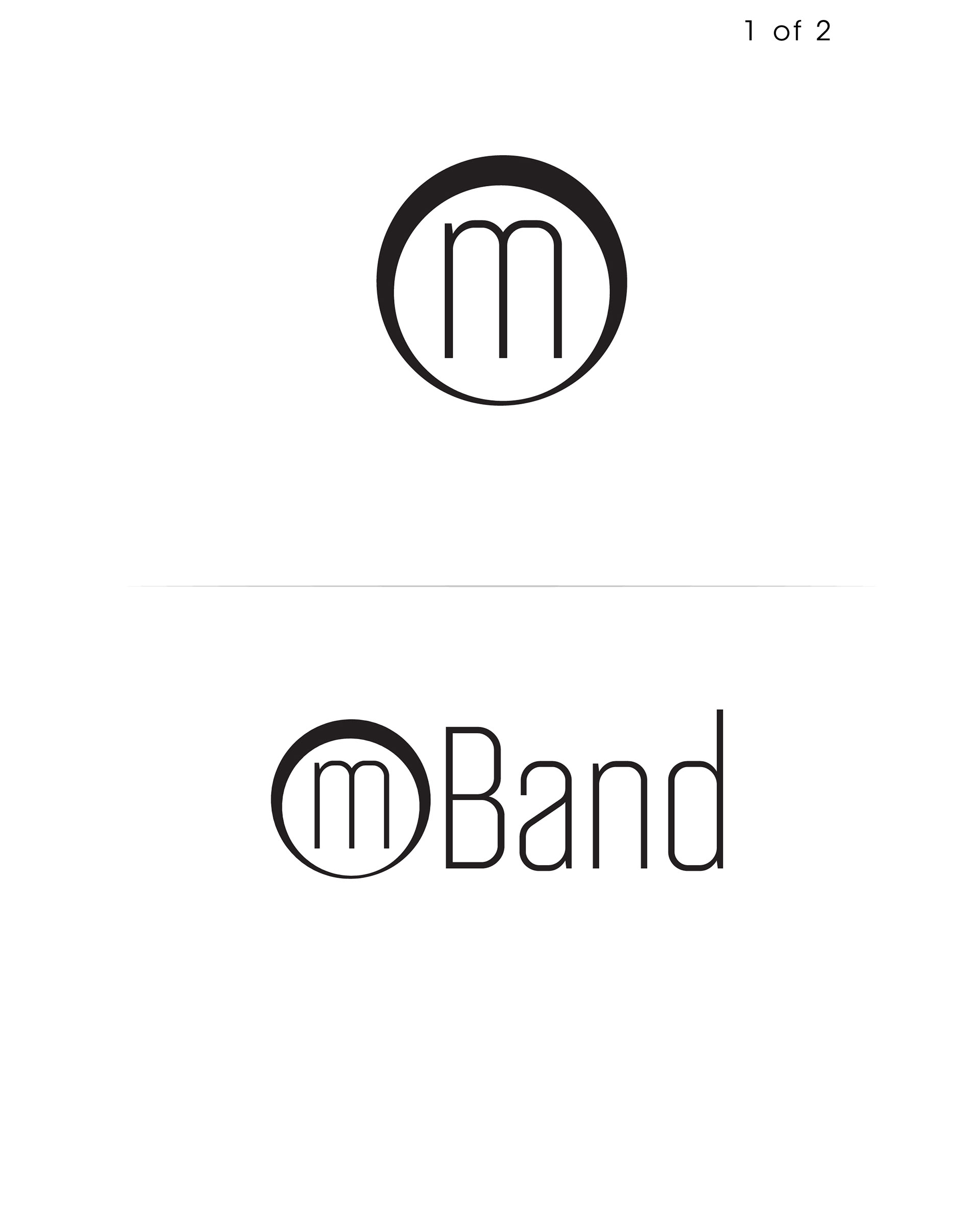
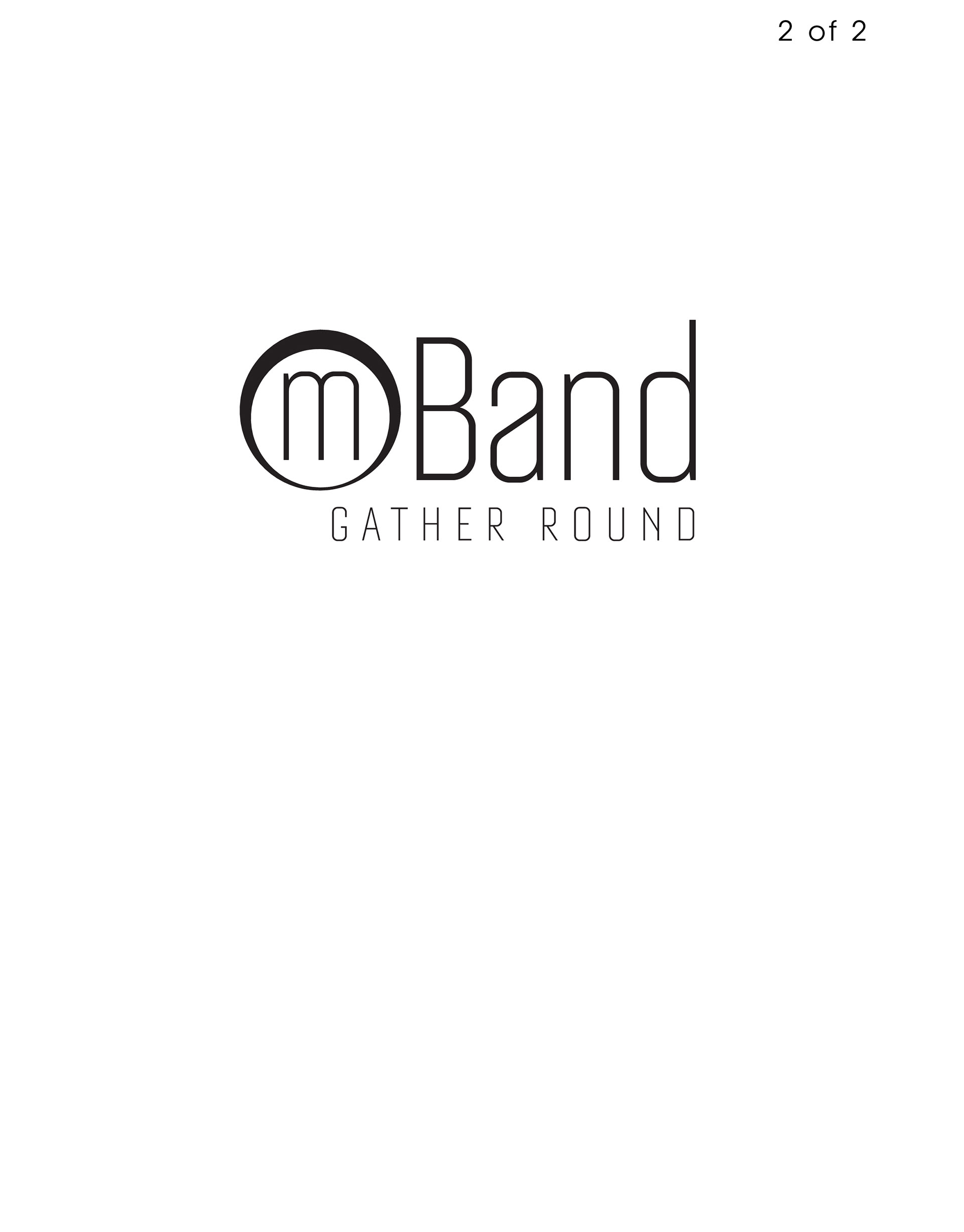
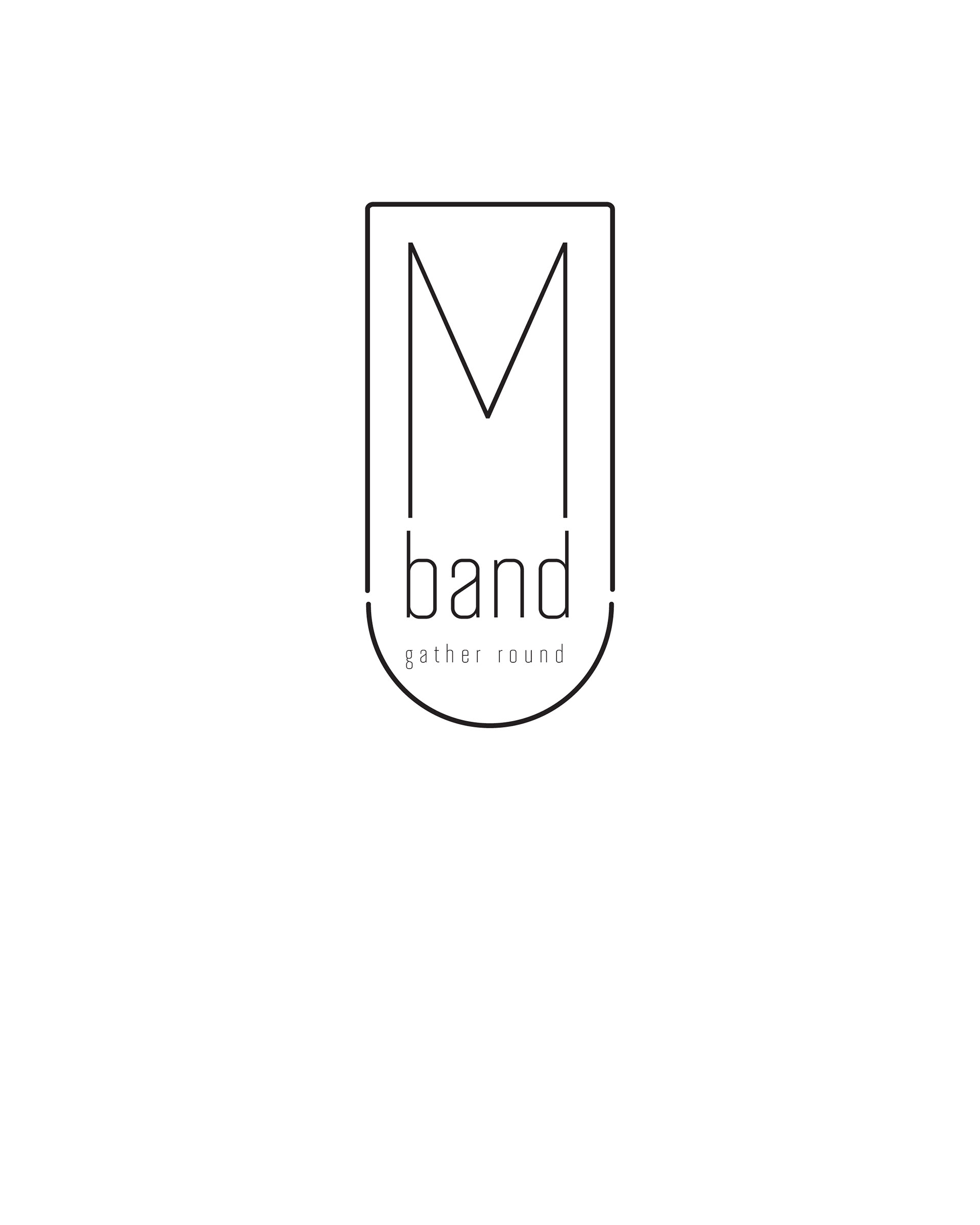
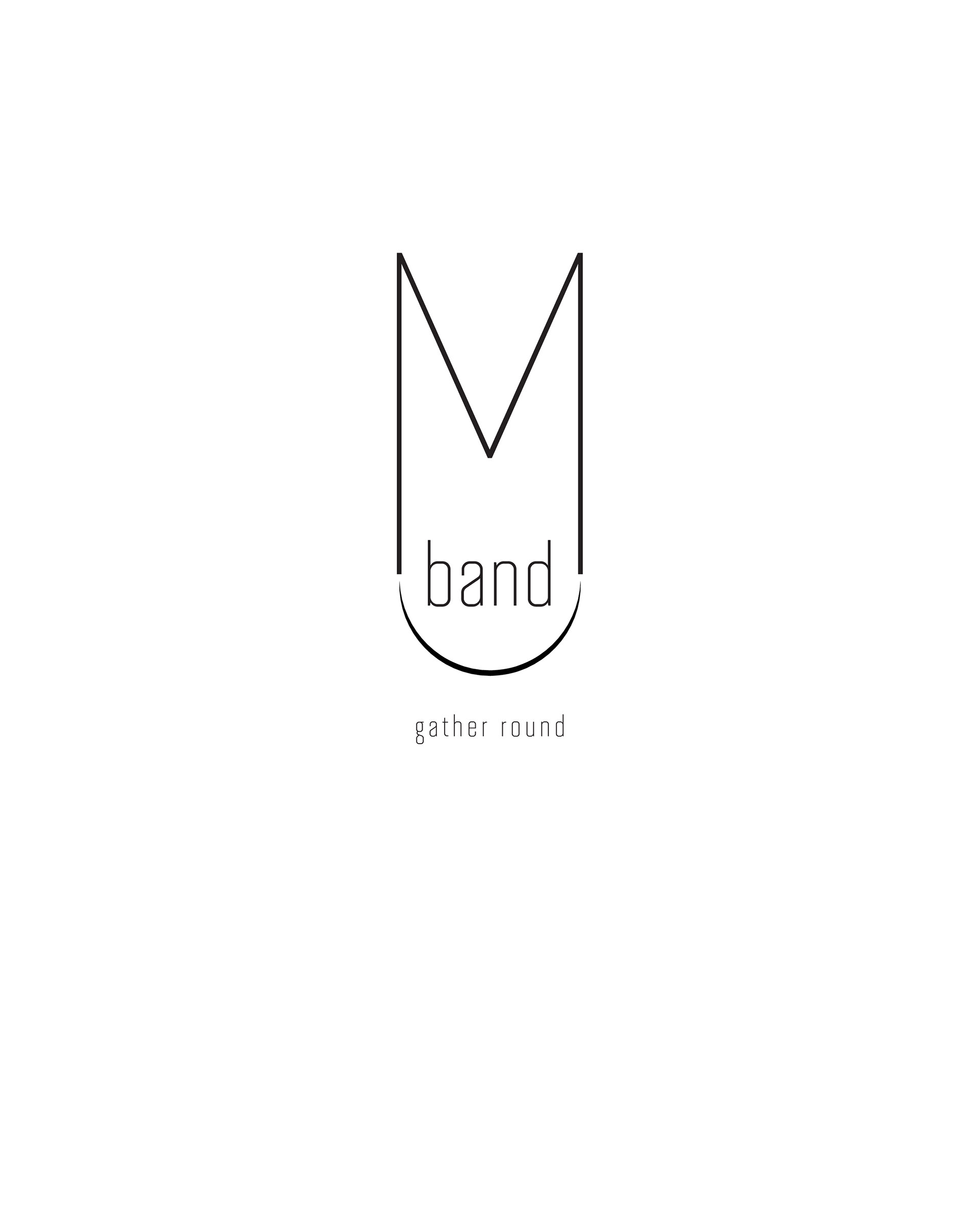

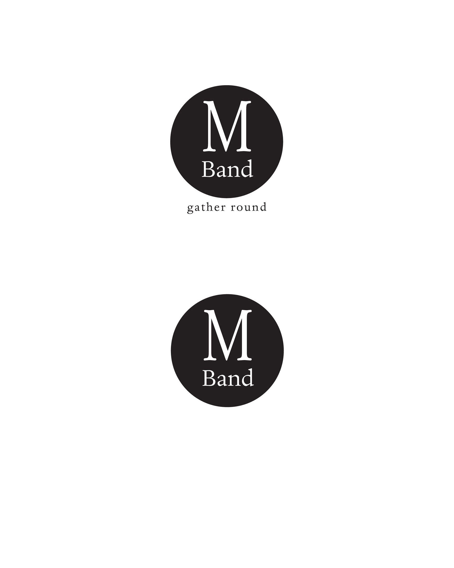
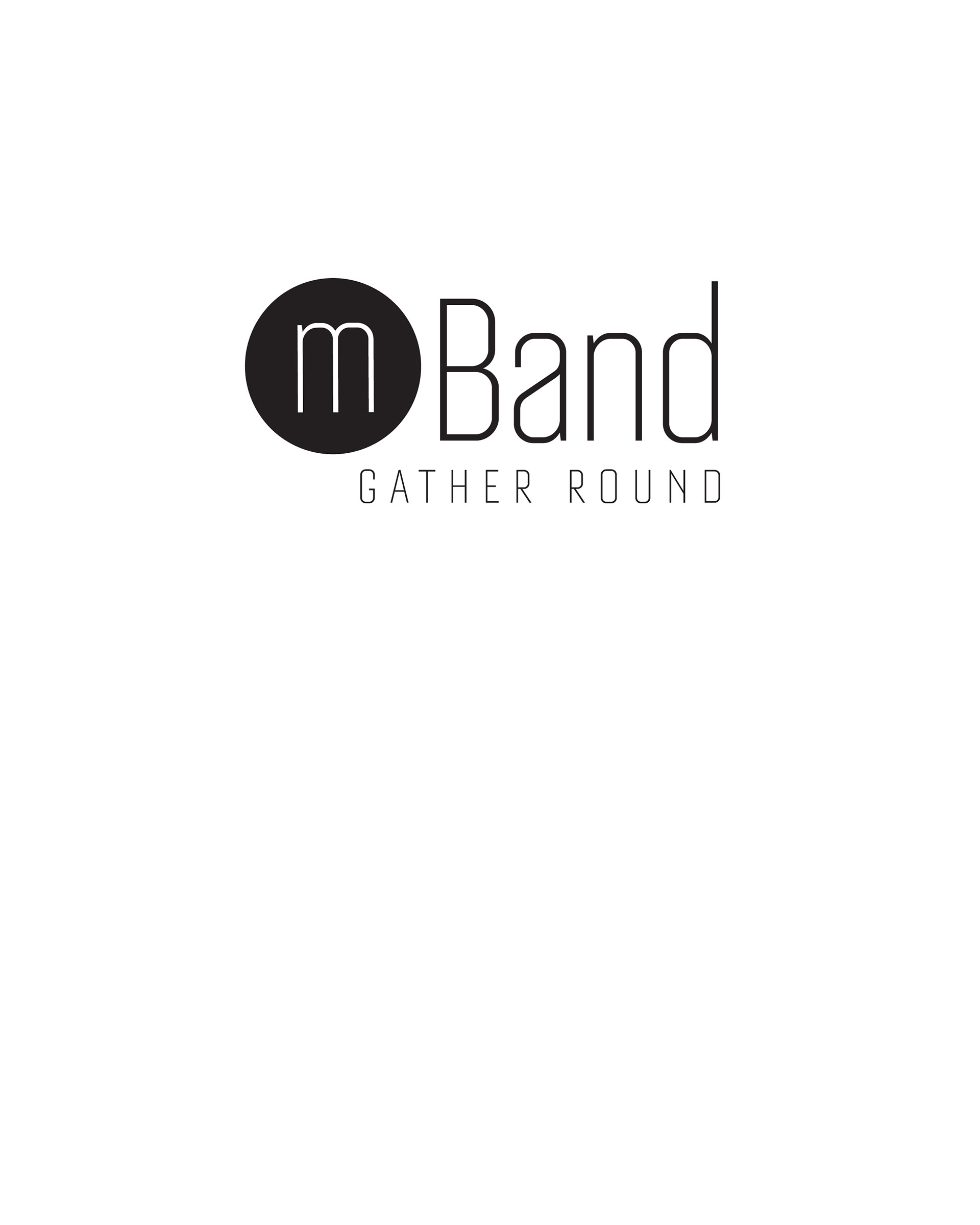
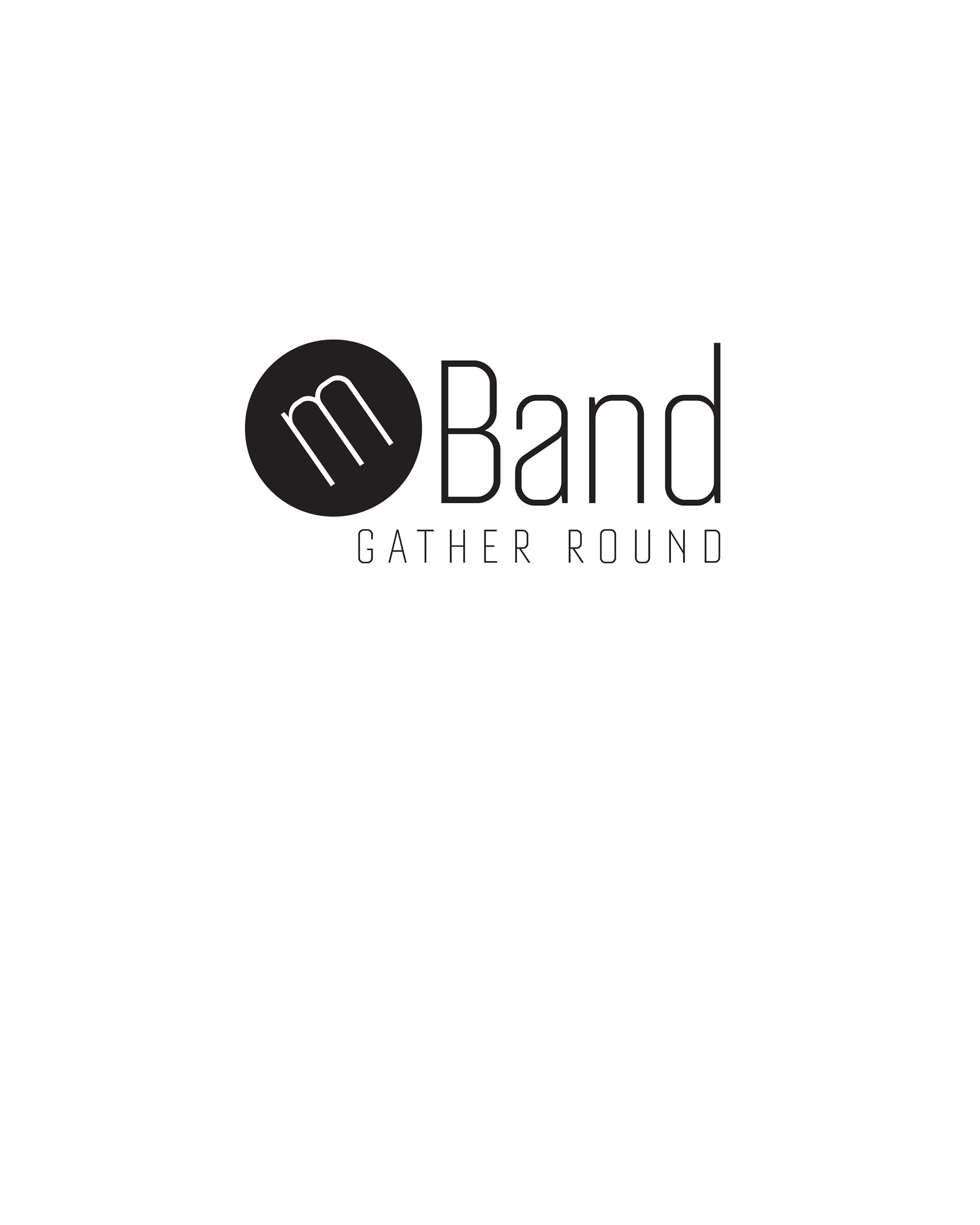
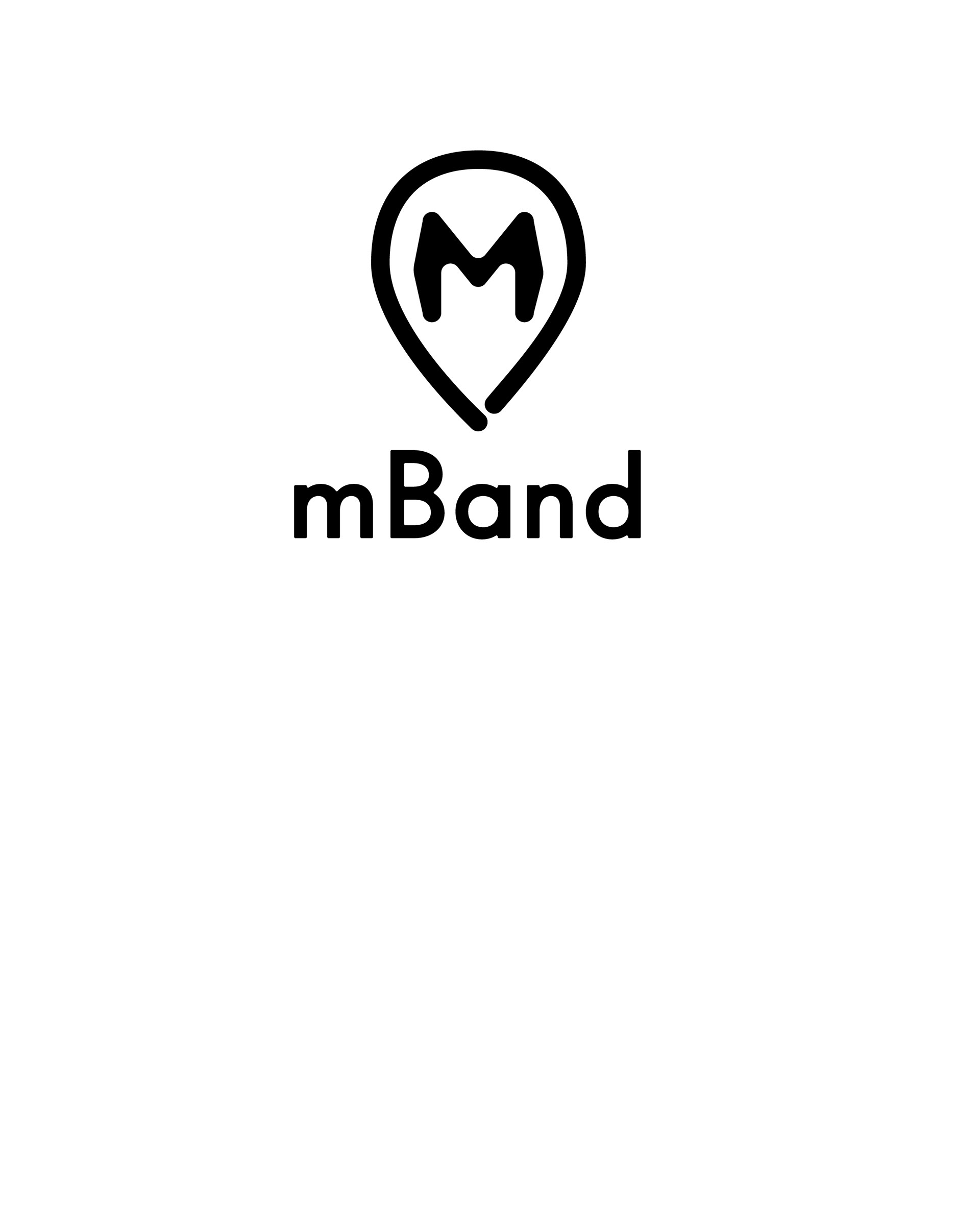

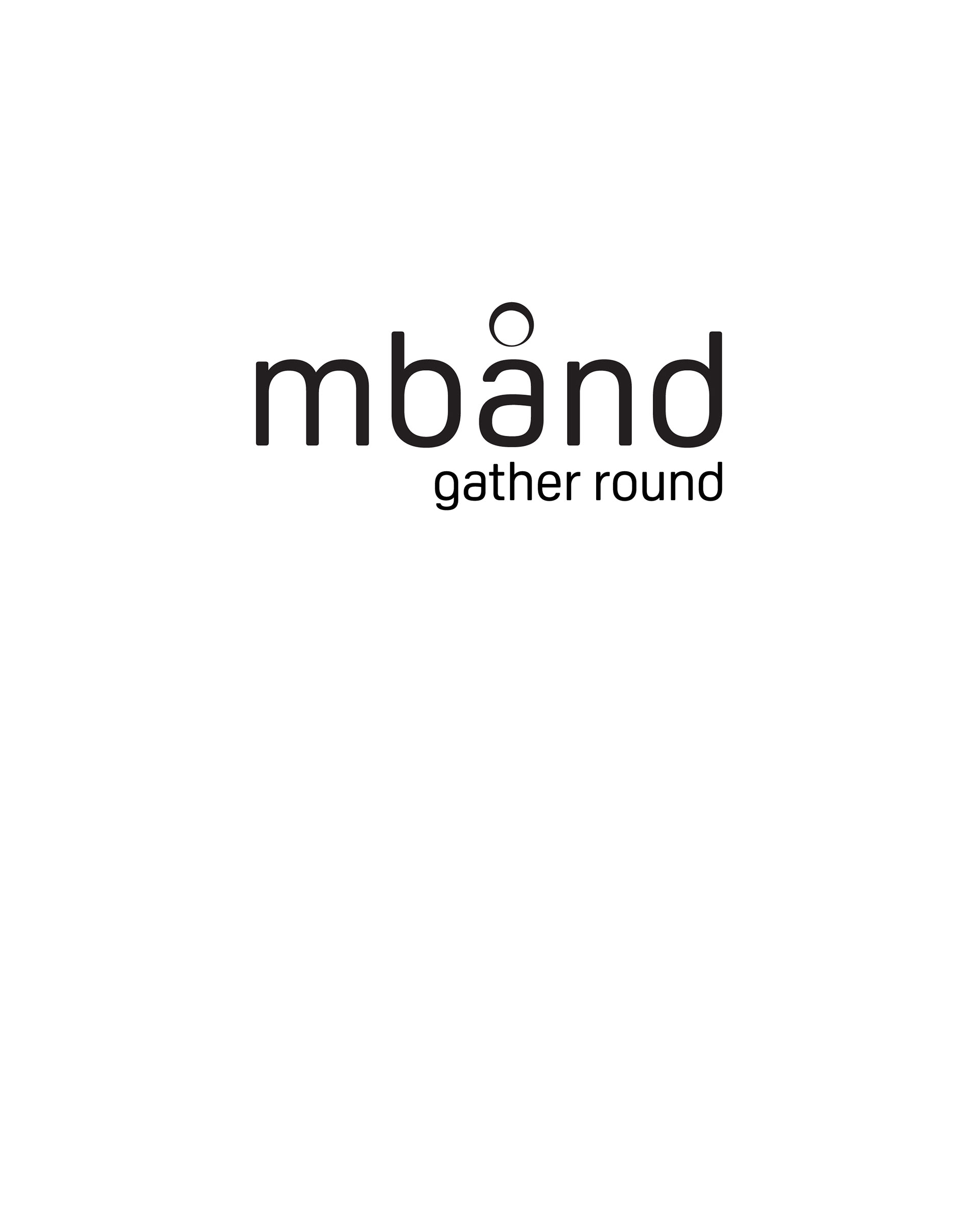

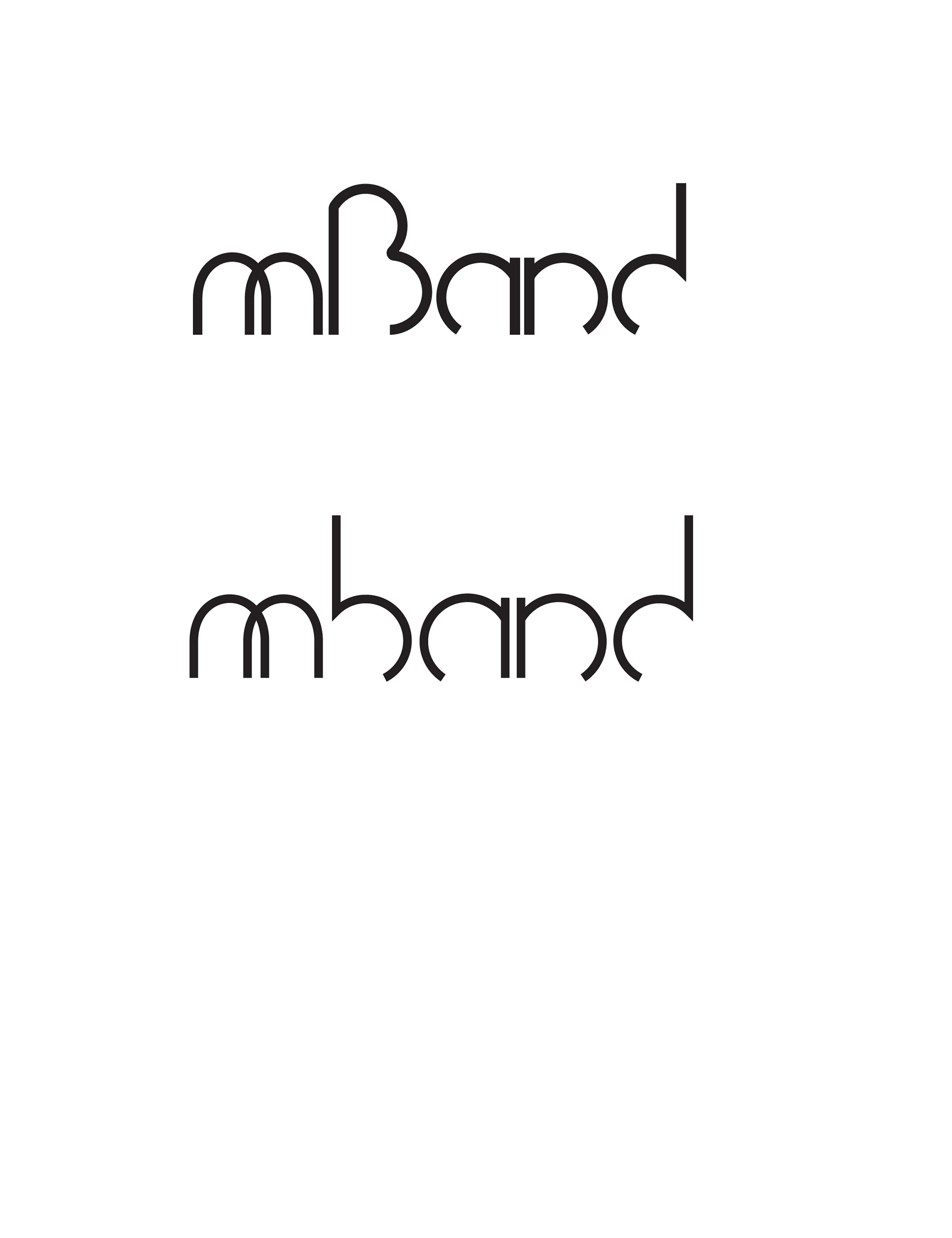


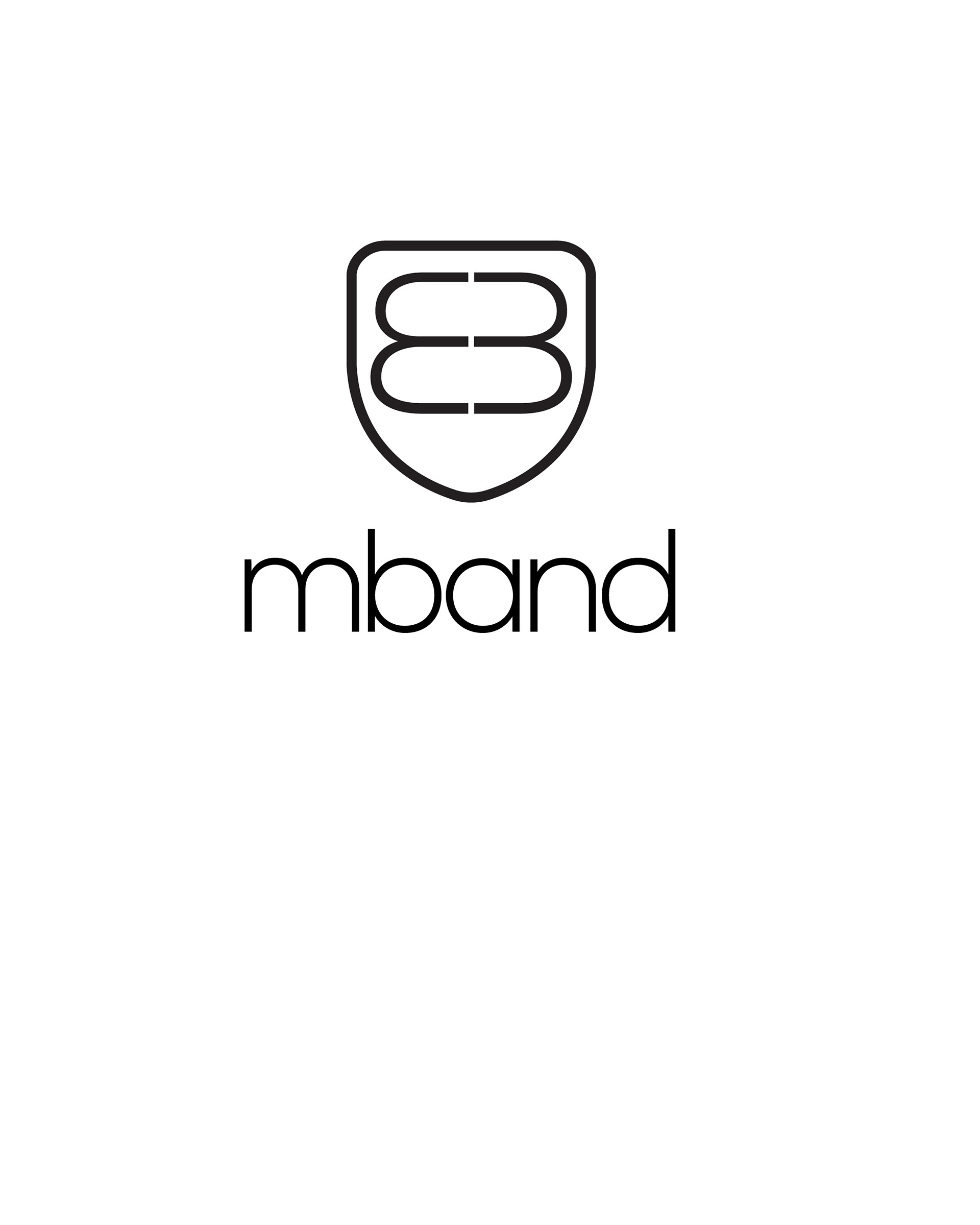

Final logo selection


mBand ring design
Industrial design
mBand was designed to look like a fashionable piece of jewelry. Our New York team developed the core aesthetics for mBand and worked with Sara Bdeir of the Rhode Island School of Design to meet the product requirements to be waterproof, component placement, have an adjustable band and feature alert triggering.

Engineering
To be fully functional, the mBand internal PCB was designed to be rugged to withstand vigorous use and small enough to be a part of an elegant piece of woman's jewelry. The PCP needed to be flexible as it had to wrap around the circumference of the ring, we collaborated with our chief hardware engineer, Alex Agafonov who was able to accomplish an engineering challenge and combine the design of a flexible PCB along with an ultra-compact and long-lasting rechargeable battery, a new break through Texas Instruments chipset and the Bluetooth 4.0 protocol intended for smartphone and mBand app communications.

Prototyping
As a team we were thrilled to have developed a working prototype of both the ring and the mBand app and continued to move forward to tweak and fine tune the mBand for final production.
Requiring a lot of painstaking attention to detail, prototyping required a lot of trial and error to complete the design. Working with our engineers and Milestone Studio, a multidisciplinary specialty design firm in Brooklyn, NY, our team began with 3D-printed models, which evolved into plastic and rubber prototypes and ultimately became finished mBand pre-production models in gold and silver.

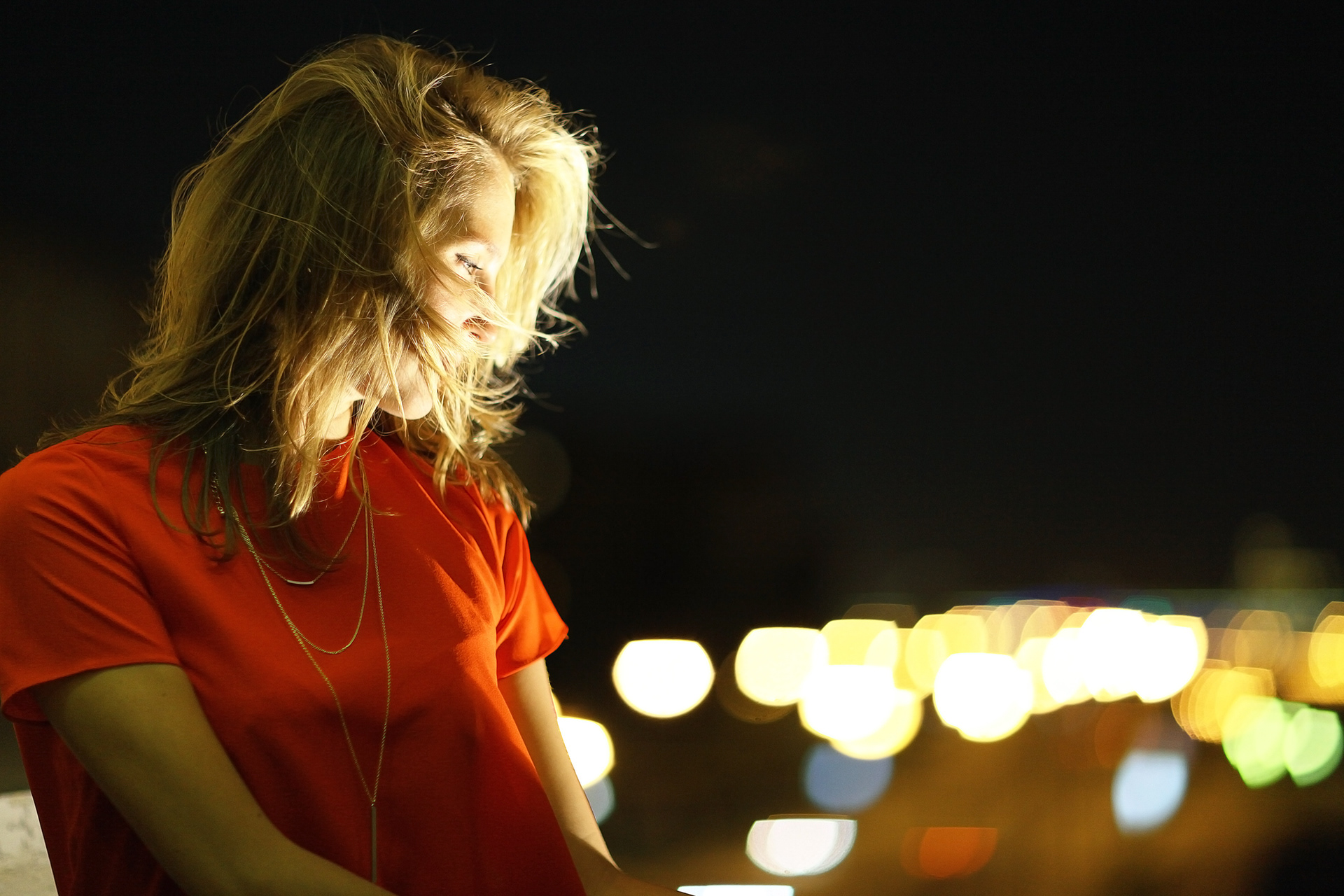
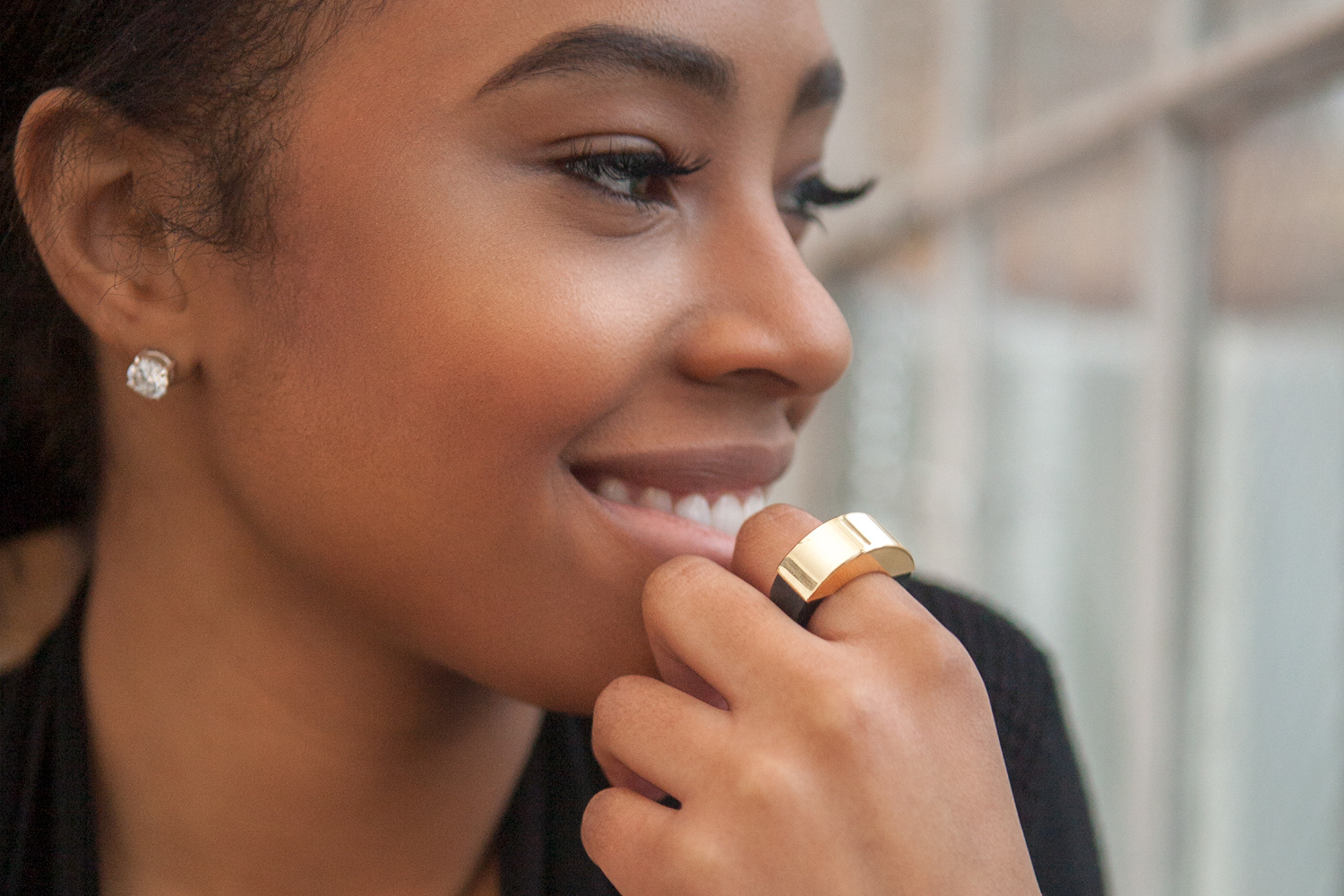
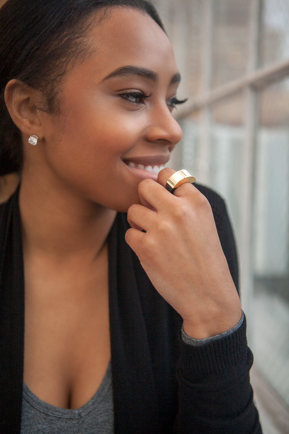
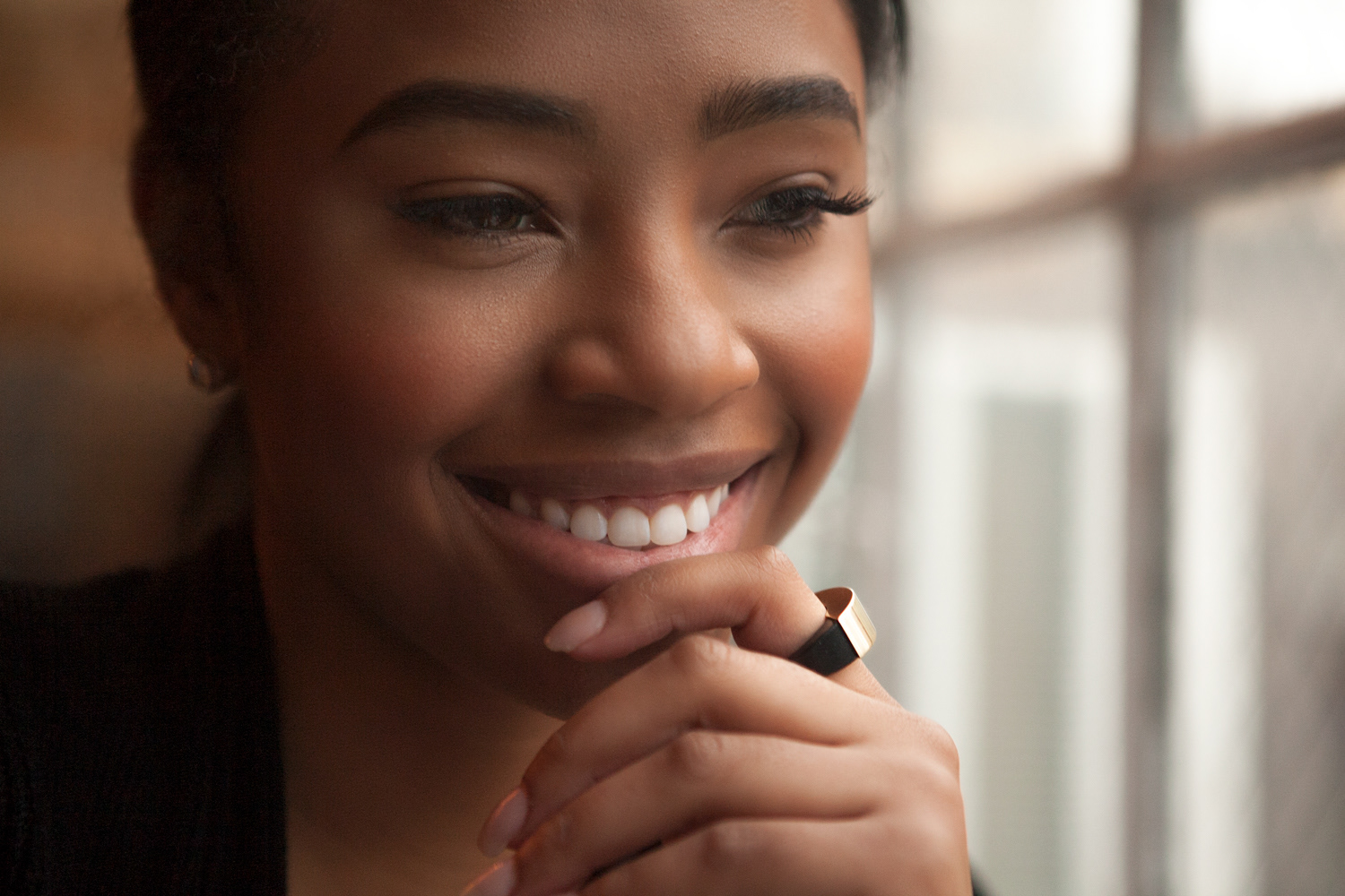
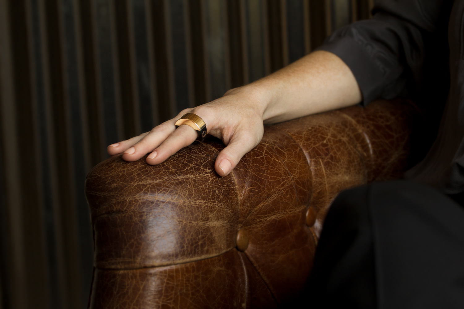
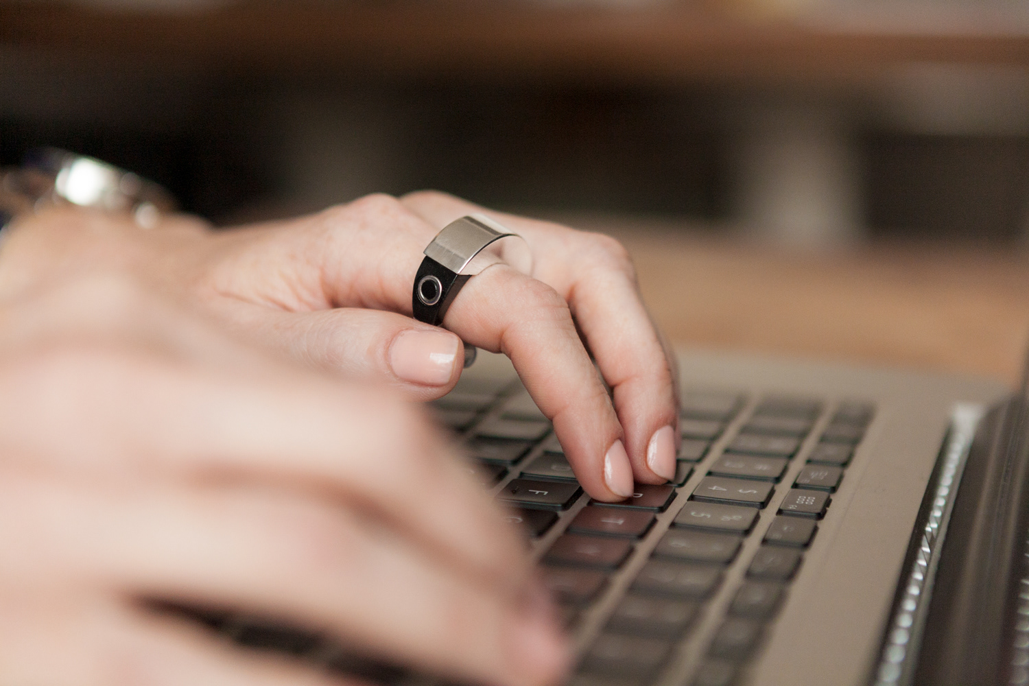
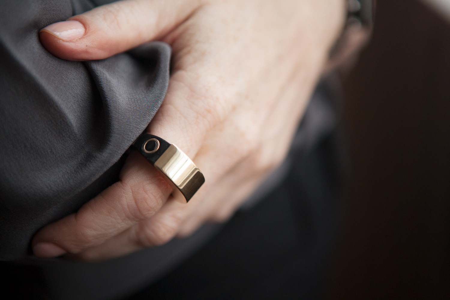
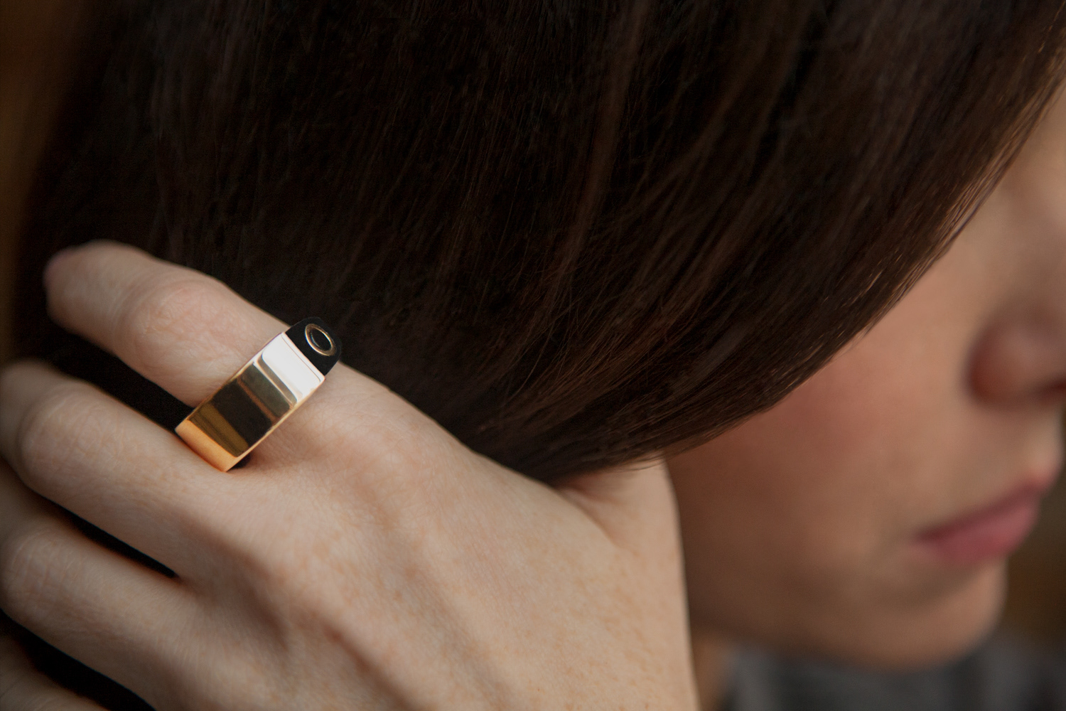
mBand studio shoot
As a multi-day shoot, these are some of the images I captured of our talent wearing the mBand ring. The product and brand positioning is aimed at being an elegant piece of jewelry a woman would wear everyday.
My direct contributions were, art direction, photographing the talent, editing and retouched the final images for use on the mBand micro site and other promotional / marketing materials.
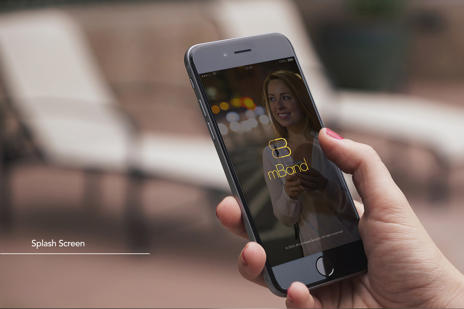
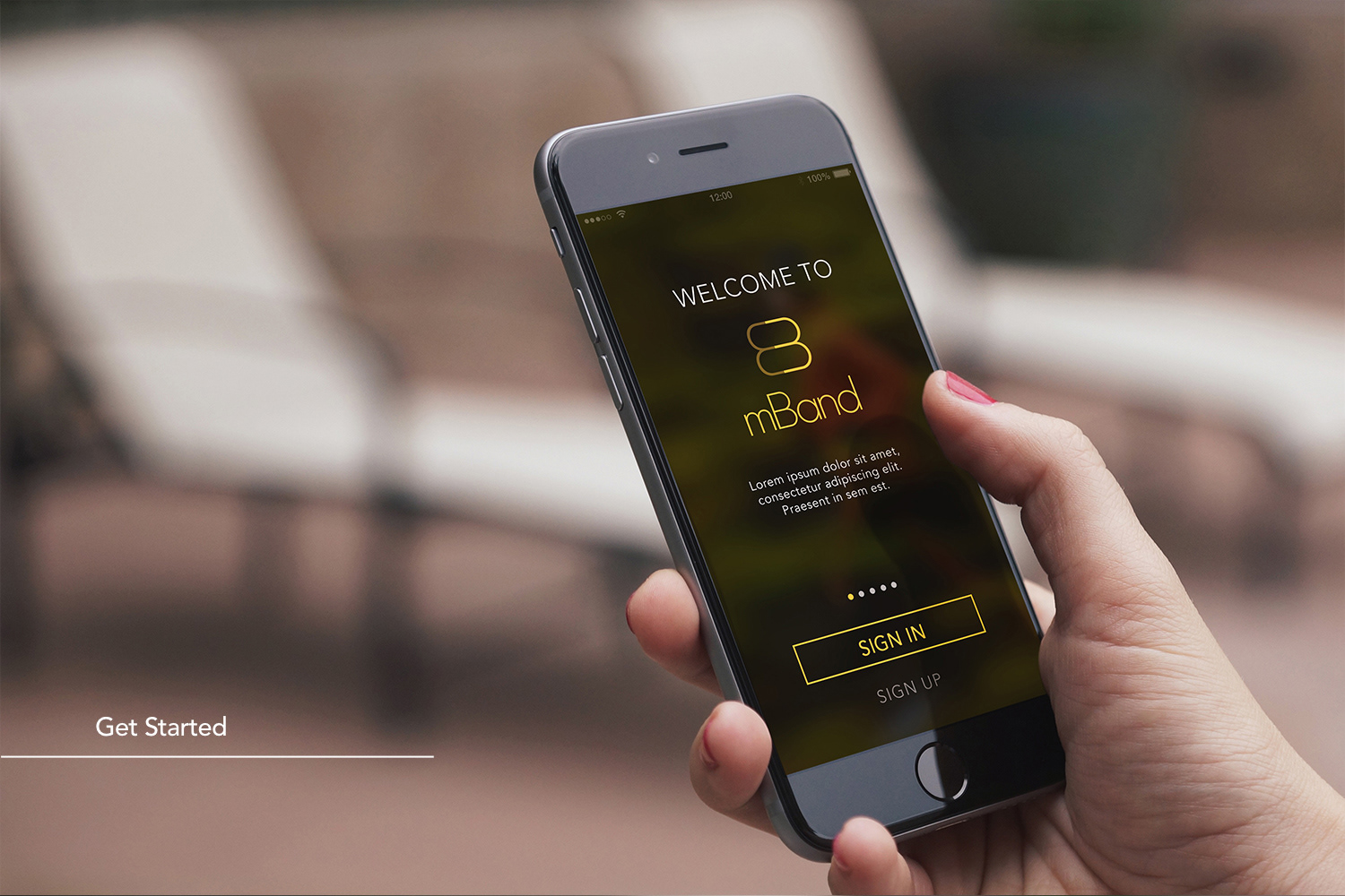
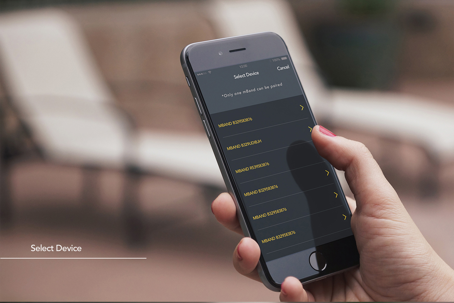
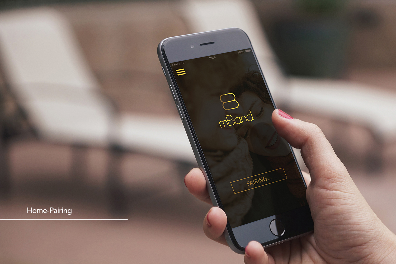
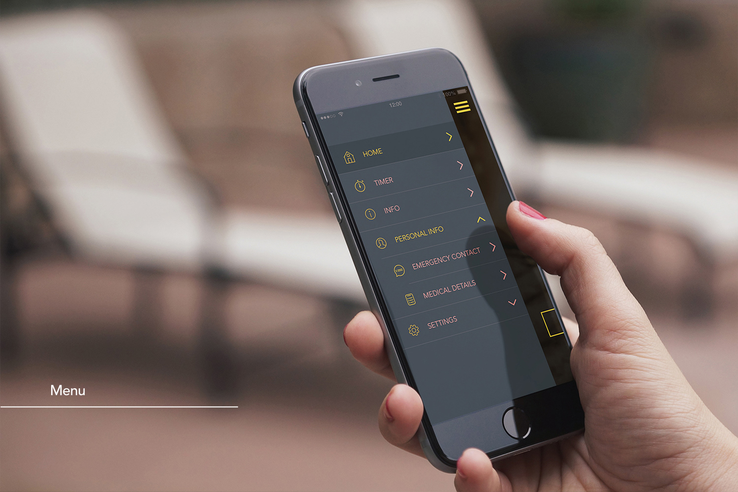
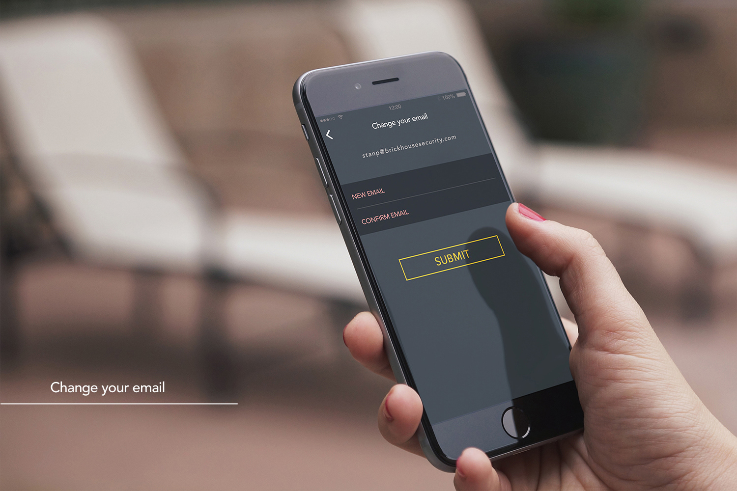
mBand app
I was thrilled to have been a part of the development process of the mBand app. Serving as the lead designer. I designed the mBan App prototype and collaborated with a third-party developer.
I used Adobe XD and Photoshop to design the app UI and visuals.


mBand microsite
In collaboration with the creative team, I provided art direction, advocating for the chosen theme for the website and working closely with the designers, copywriters and creative director.
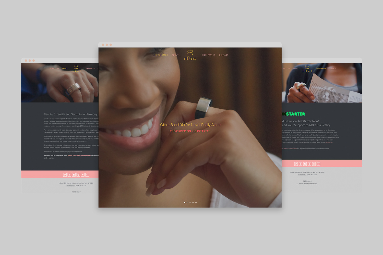
mBand was a BrickHouse Security Kickstarter campaign.